BasicTable 表格
基于
Ant Design Vue封装的table 组件 BasicTable ,用于展示列表数据。为了使用方便,内部做了一定的hook封装,简化使用。如需扩展,请修改hook:/@/hooks/system/useListPage
使用场景
- 表格是企业项目必用的功能,当有大量结构化的数据需要展现时;
- 当需要对数据进行排序、搜索、分页、自定义操作等复杂行为时。
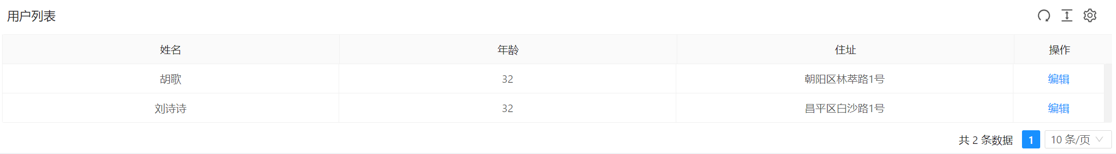
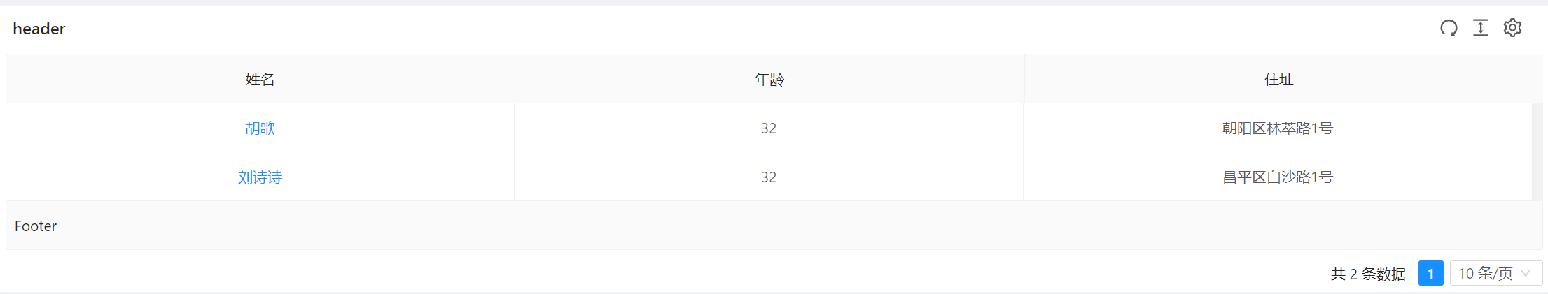
1.基本用法
本例演示:怎样快速渲染一个静态数据表格。指定表格的数据源 dataSource 为一个静态数组。
- 页面效果
- 示例代码
<template>
  <!--定义表格-->
  <BasicTable @register="registerTable">
    <!--操作栏-->
    <template #action="{ record }">
      <TableAction :actions="getTableAction(record)" />
    </template>
  </BasicTable>
</template>

<script lang="ts" name="basic-table-demo" setup>
  import { ActionItem, BasicColumn, BasicTable, TableAction } from '/@/components/Table';
  import { useListPage } from '/@/hooks/system/useListPage';
  //定义表格列字段
  const columns: BasicColumn[] = [
    {
      title: '姓名',
      dataIndex: 'name',
      key: 'name',
    },
    {
      title: '年龄',
      dataIndex: 'age',
      key: 'age',
    },
    {
      title: '住址',
      dataIndex: 'address',
      key: 'address',
    },
  ];
   /** useListPage 是整个框架的核心用于表格渲染,里边封装了很多公共方法;
    * 平台通过此封装,简化了代码,支持自定义扩展*/
  // 通过hook useListPage渲染表格(设置dataSource、columns、actionColumn等参数)
  const { tableContext } = useListPage({
    designScope: 'basic-table-demo',
    tableProps: {
      title: '用户列表',
      dataSource: [
        {
          key: '1',
          name: '胡歌',
          age: 32,
          address: '朝阳区林萃路1号',
        },
        {
          key: '2',
          name: '刘诗诗',
          age: 32,
          address: '昌平区白沙路1号',
        },
      ],
      columns: columns,
      size: 'small',
      actionColumn: {
        width: 120,
      },
    },
  });
  // BasicTable绑定注册
  const [registerTable] = tableContext;
  /**
   * 操作栏
   */
  function getTableAction(record): ActionItem[] {
    return [
      {
        label: '编辑',
        onClick: handleEdit.bind(null, record),
      },
    ];
  }

  function handleEdit(record) {
    console.log(record);
  }
</script>
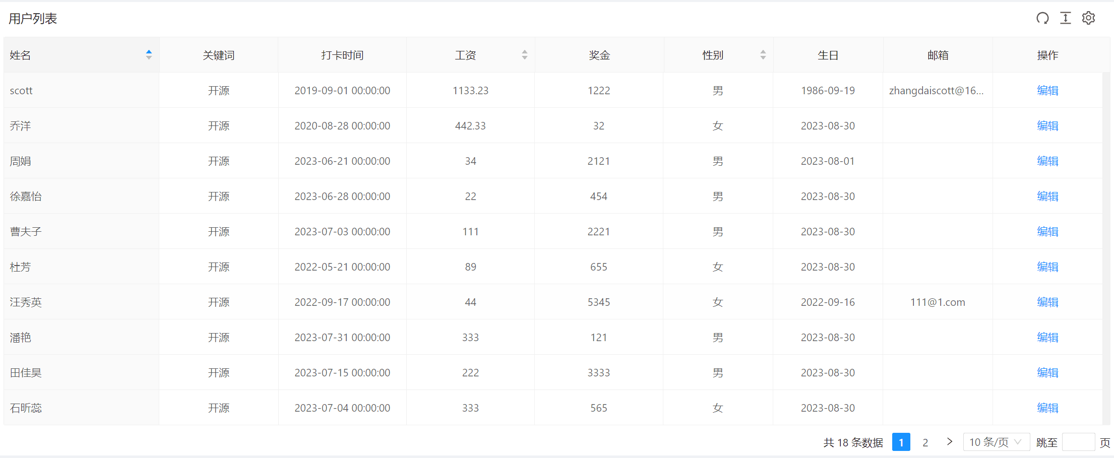
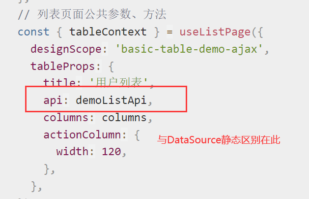
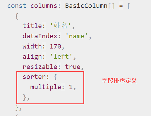
2.远程加载数据
本例演示:通过 ajax api请求的方式加载数据,从服务端读取并展现数据。并配置了列宽拖拽、排序等功能。开发者可以自行接入其他数据处理方式。
- 页面效果
- 示例代码

<template>
  <!--定义表格-->
  <BasicTable @register="registerTable">
    <!--操作栏-->
    <template #action="{ record }">
      <TableAction :actions="getTableAction(record)" />
    </template>
  </BasicTable>
</template>

<script lang="ts" name="basic-table-demo" setup>
  import { ActionItem, BasicColumn, BasicTable, TableAction } from '/@/components/Table';
  import { useListPage } from '/@/hooks/system/useListPage';
  import { defHttp } from '/@/utils/http/axios';
  //定义表格列
  const columns: BasicColumn[] = [
    {
      title: '姓名',
      dataIndex: 'name',
      width: 170,
      align: 'left',
      resizable: true,
      sorter: {
        multiple: 1,
      },
    },
    {
      title: '关键词',
      dataIndex: 'keyWord',
      width: 130,
      resizable: true,
    },
    {
      title: '打卡时间',
      dataIndex: 'punchTime',
      width: 140,
      resizable: true,
    },
    {
      title: '工资',
      dataIndex: 'salaryMoney',
      width: 140,
      resizable: true,
      sorter: {
        multiple: 2,
      },
    },
    {
      title: '奖金',
      dataIndex: 'bonusMoney',
      width: 140,
      resizable: true,
    },
    {
      title: '性别',
      dataIndex: 'sex',
      sorter: {
        multiple: 3,
      },
      customRender: ({ record }) => {
        return record.sex ? (record.sex == '1' ? '男' : '女') : '';
      },
      width: 120,
      resizable: true,
    },
    {
      title: '生日',
      dataIndex: 'birthday',
      width: 120,
      resizable: true,
    },
    {
      title: '邮箱',
      dataIndex: 'email',
      width: 120,
      resizable: true,
    },
  ];
  //ajax请求api接口
  const demoListApi = (params) => {
    return defHttp.get({ url: '/test/jeecgDemo/list', params });
  };
  // 列表页面公共参数、方法
  const { tableContext } = useListPage({
    designScope: 'basic-table-demo-ajax',
    tableProps: {
      title: '用户列表',
      api: demoListApi,
      columns: columns,
      actionColumn: {
        width: 120,
      },
    },
  });
  //BasicTable绑定注册
  const [registerTable] = tableContext;
  /**
   * 操作栏
   */
  function getTableAction(record): ActionItem[] {
    return [
      {
        label: '编辑',
        onClick: handleEdit.bind(null, record),
      },
    ];
  }

  function handleEdit(record) {
    console.log(record);
  }
</script>
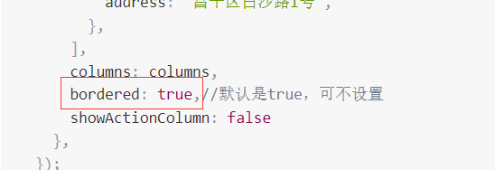
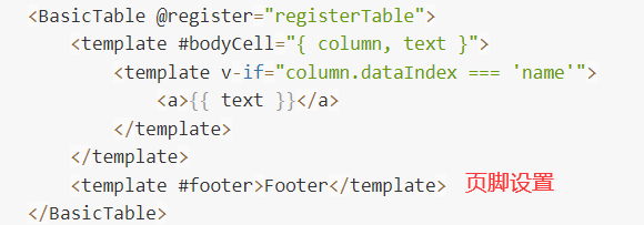
3.带边框
本例演示:通过 useListPage的 tableProps 的参数 bordered 设置边框,添加表格边框线,此外还定义了自定义页脚。
- 页面效果
- 示例代码
<template>
  <!--定义表格-->
  <BasicTable @register="registerTable">
      <template #bodyCell="{ column, text }">
          <template v-if="column.dataIndex === 'name'">
              <a>{{ text }}</a>
          </template>
      </template>
      <template #footer>Footer</template>
  </BasicTable>
</template>

<script lang="ts" name="basic-table-demo" setup>
  import { ActionItem, BasicColumn, BasicTable, TableAction } from '/@/components/Table';
  import { useListPage } from '/@/hooks/system/useListPage';
  //定义表格列
  const columns: BasicColumn[] = [
    {
      title: '姓名',
      dataIndex: 'name',
      key: 'name',
    },
    {
      title: '年龄',
      dataIndex: 'age',
      key: 'age',
    },
    {
      title: '住址',
      dataIndex: 'address',
      key: 'address',
    },
  ];
  // 列表页面公共参数、方法
  const { tableContext } = useListPage({
    designScope: 'basic-table-demo',
    tableProps: {
      title:'header',
      dataSource: [
        {
          key: '1',
          name: '胡歌',
          age: 32,
          address: '朝阳区林萃路1号',
        },
        {
          key: '2',
          name: '刘诗诗',
          age: 32,
          address: '昌平区白沙路1号',
        },
      ],
      columns: columns,
      bordered: true,//默认是true,可不设置
      showActionColumn: false
    },
  });
  //BasicTable绑定注册
  const [registerTable] = tableContext;
  /**
   * 操作栏
   */
  function getTableAction(record): ActionItem[] {
    return [
      {
        label: '编辑',
        onClick: handleEdit.bind(null, record),
      },
    ];
  }

  function handleEdit(record) {
    console.log(record);
  }
</script>
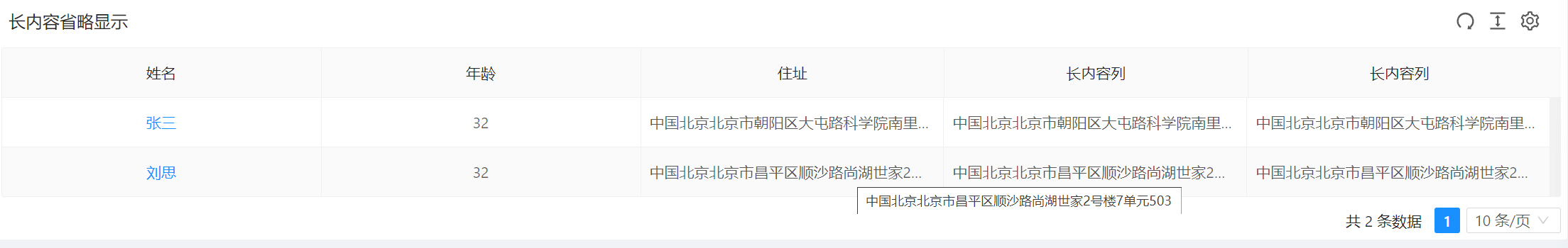
4.单元格自动省略
本例演示 :单元格列 column 设置 ellipsis 属性,可以让单元格内容根据宽度自动省略。
- 页面效果
- 示例代码

<template>
  <!--定义表格-->
  <BasicTable @register="registerTable">
      <template #bodyCell="{ column, text }">
          <template v-if="column.dataIndex === 'name'">
              <a>{{ text }}</a>
          </template>
      </template>
  </BasicTable>
</template>

<script lang="ts" name="basic-table-demo" setup>
  import { ActionItem, BasicColumn, BasicTable, TableAction } from '/@/components/Table';
  import { useListPage } from '/@/hooks/system/useListPage';
  //定义表格列
  const columns: BasicColumn[] = [
    {
      title: '姓名',
      dataIndex: 'name',
      key: 'name',
      width:300
    },
    {
      title: '年龄',
      dataIndex: 'age',
      key: 'age',
      width:300
    },
    {
      title: '住址',
      dataIndex: 'address',
      key: 'address',
      ellipsis:true
    },
    {
      title: '长内容列',
      dataIndex: 'address',
      key: 'address 2',
      ellipsis: true,
    },
    {
      title: '长内容列',
      dataIndex: 'address',
      key: 'address 3',
      ellipsis: true,
    },
  ];
  // 列表页面公共参数、方法
  const { tableContext } = useListPage({
    designScope: 'basic-table-demo',
    tableProps: {
      title:'长内容省略显示',
      dataSource: [
        {
          key: '1',
          name: '张三',
          age: 32,
          address: '中国北京北京市朝阳区大屯路科学院南里1号楼3单元401',
        },
        {
          key: '2',
          name: '刘思',
          age: 32,
          address: '中国北京北京市昌平区顺沙路尚湖世家2号楼7单元503',
        },
      ],
      columns: columns,
      showActionColumn: false
    },
  });

  //BasicTable绑定注册
  const [registerTable] = tableContext;
  /**
   * 操作栏
   */
  function getTableAction(record): ActionItem[] {
    return [
      {
        label: '编辑',
        onClick: handleEdit.bind(null, record),
      },
    ];
  }

  function handleEdit(record) {
    console.log(record);
  }
</script>
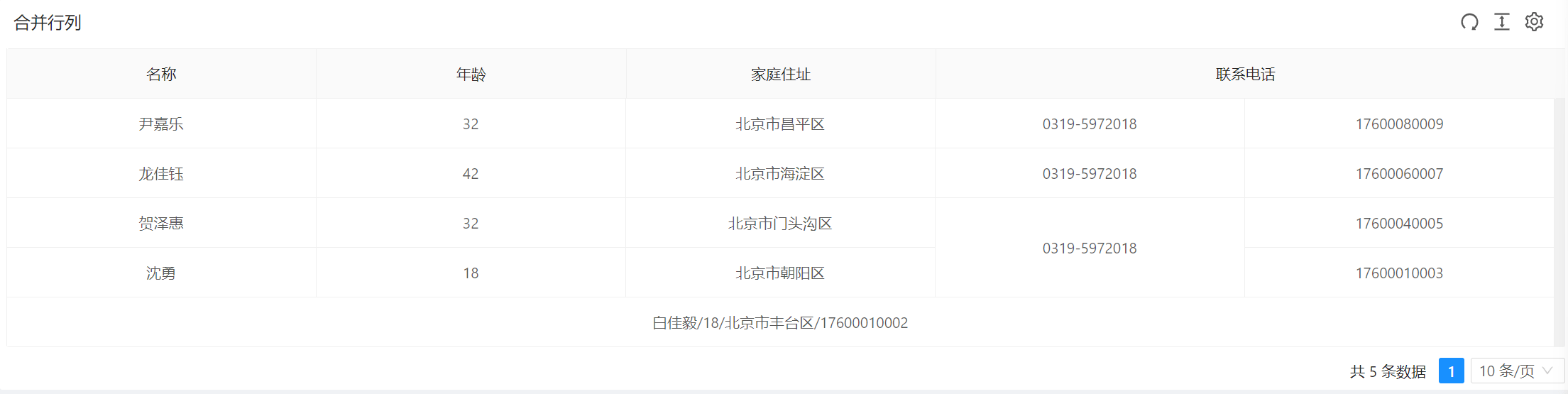
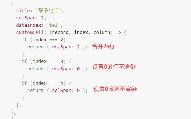
5.表格行列合并
本例演示:如何使用 column 的 colSpan/rowSpan属性,实现表格的行/列合并。使用 render 里的单元格属性 colSpan 或者 rowSpan 设值为 0 时,设置的表格不会渲染
- 页面效果
- 示例代码
<template>
  <!--定义表格-->
  <BasicTable @register="registerTable">
    <!--操作栏-->
    <template #action="{ record }">
      <TableAction :actions="getTableAction(record)" />
    </template>
  </BasicTable>
</template>

<script lang="ts" name="basic-table-demo" setup>
  import { ActionItem, BasicColumn, BasicTable, TableAction } from '/@/components/Table';
  import { useListPage } from '/@/hooks/system/useListPage';
  //定义表格列
  const columns: BasicColumn[] = [
    {
      title: '名称',
      dataIndex: 'name',
      customCell: (record, index, column) => ({
        colSpan: index < 4 ? 1 : 5,
      }),
      customRender: ({ text, record, index, column }) => {
          return index < 4?text:`${record.name}/${record.age}/${record.address}/${record.phone}`
      },
    },
    {
      title: '年龄',
      dataIndex: 'age',
      customCell: (record, index, column) => {
        if (index === 4) {
          return { colSpan: 0 };
        }
      },
    },
    {
      title: '家庭住址',
      dataIndex: 'address',
      customCell: (record, index, column) => {
        if (index === 4) {
          return { colSpan: 0 };
        }
      },
    },
    {
      title: '联系电话',
      colSpan: 2,
      dataIndex: 'tel',
      customCell: (record, index, column) => {
        if (index === 2) {
          return { rowSpan: 2 };
        }
        if (index === 3) {
          return { rowSpan: 0 };
        }
        if (index === 4) {
          return { colSpan: 0 };
        }
      },
    },
    {
      title: 'Phone',
      colSpan: 0,
      dataIndex: 'phone',
      customCell: (record, index, column) => {
        if (index === 4) {
          return { colSpan: 0 };
        }
      },
    },
  ];
  // 列表页面公共参数、方法
  const { tableContext } = useListPage({
    designScope: 'basic-table-demo',
    tableProps: {
      title: '合并行列',
      dataSource: [
        {
          key: '1',
          name: '尹嘉乐',
          age: 32,
          tel: '0319-5972018',
          phone: 17600080009,
          address: '北京市昌平区',
        },
        {
          key: '2',
          name: '龙佳钰',
          tel: '0319-5972018',
          phone: 17600060007,
          age: 42,
          address: '北京市海淀区',
        },
        {
          key: '3',
          name: '贺泽惠',
          age: 32,
          tel: '0319-5972018',
          phone: 17600040005,
          address: '北京市门头沟区',
        },
        {
          key: '4',
          name: '沈勇',
          age: 18,
          tel: '0319-5972018',
          phone: 17600010003,
          address: '北京市朝阳区',
        },
        {
          key: '5',
          name: '白佳毅',
          age: 18,
          tel: '0319-5972018',
          phone: 17600010002,
          address: '北京市丰台区',
        },
      ],
      columns: columns,
      showActionColumn: false,
    },
  });

  //BasicTable绑定注册
  const [registerTable] = tableContext;
  /**
   * 操作栏
   */
  function getTableAction(record): ActionItem[] {
    return [
      {
        label: '编辑',
        onClick: handleEdit.bind(null, record),
      },
    ];
  }

  function handleEdit(record) {
    console.log(record);
  }
</script>
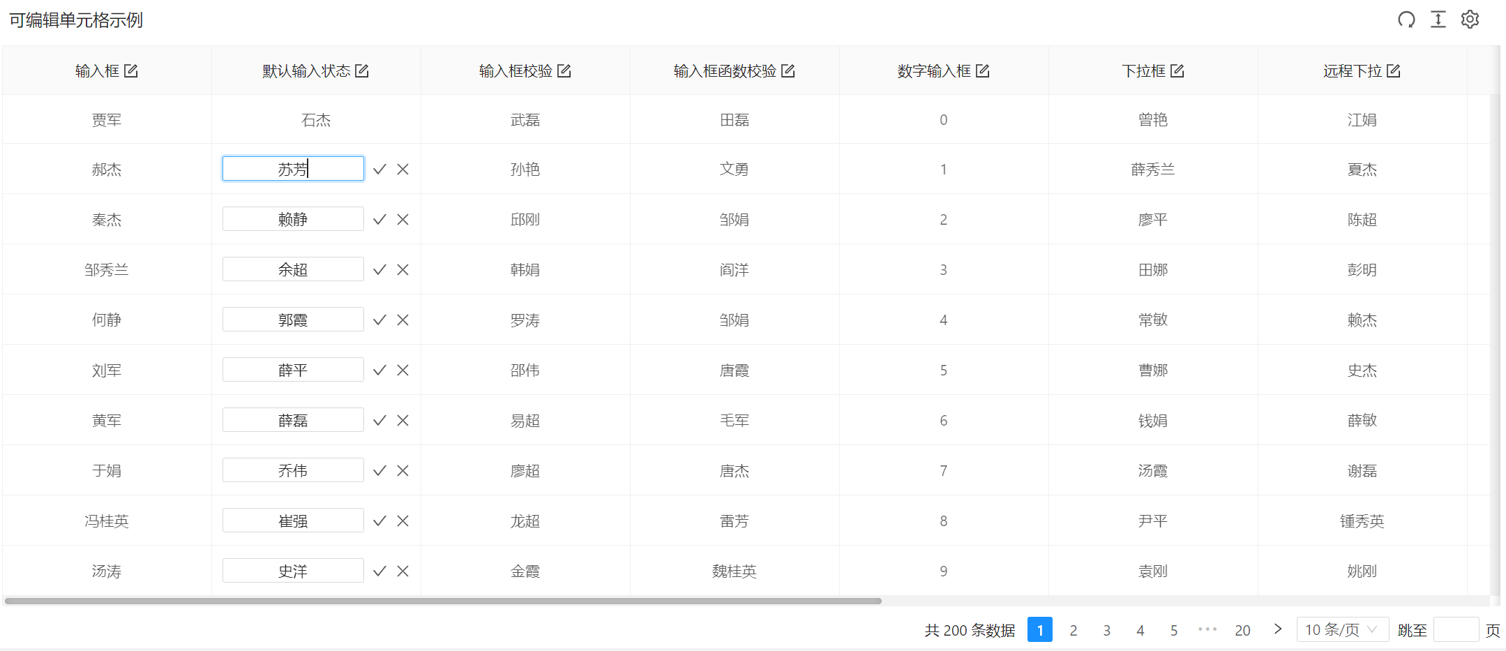
6.可编辑单元格
本例演示:怎样配置单元格可编辑功能的表格。
- 页面效果
- 示例代码
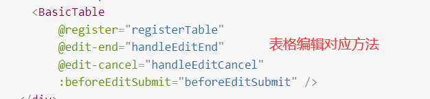
<template>
<div class="p-4">
<BasicTable
@register="registerTable"
@edit-end="handleEditEnd"
@edit-cancel="handleEditCancel"
:beforeEditSubmit="beforeEditSubmit" />
</div>
</template>
<script lang="ts">
import { defineComponent } from 'vue';
import { BasicTable, useTable, BasicColumn } from '/@/components/Table';
import { optionsListApi } from '/@/api/demo/select';
import { demoListApi } from '/@/api/demo/table';
import { treeOptionsListApi } from '/@/api/demo/tree';
import { useMessage } from '/@/hooks/web/useMessage';
import { useListPage } from '/@/hooks/system/useListPage';
const columns: BasicColumn[] = [
{
title: '输入框',
dataIndex: 'name',
edit: true,
editComponentProps: {
prefix: '$',
},
width: 200,
},
{
title: '默认输入状态',
dataIndex: 'name7',
edit: true,
editable: true,
width: 200,
},
{
title: '输入框校验',
dataIndex: 'name1',
edit: true,
// 默认必填校验
editRule: true,
width: 200,
},
{
title: '输入框函数校验',
dataIndex: 'name2',
edit: true,
editRule: async (text) => {
if (text === '2') {
return '不能输入该值';
}
return '';
},
width: 200,
},
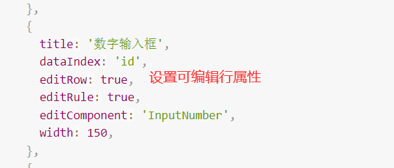
{
title: '数字输入框',
dataIndex: 'id',
edit: true,
editRule: true,
editComponent: 'InputNumber',
width: 200,
},
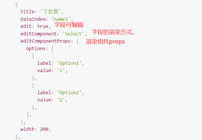
{
title: '下拉框',
dataIndex: 'name3',
edit: true,
editComponent: 'Select',
editComponentProps: {
options: [
{
label: 'Option1',
value: '1',
},
{
label: 'Option2',
value: '2',
},
],
},
width: 200,
},
{
title: '远程下拉',
dataIndex: 'name4',
edit: true,
editComponent: 'ApiSelect',
editComponentProps: {
api: optionsListApi,
resultField: 'list',
labelField: 'name',
valueField: 'id',
},
width: 200,
},
{
title: '远程下拉树',
dataIndex: 'name71',
edit: true,
editComponent: 'ApiTreeSelect',
editRule: false,
editComponentProps: {
api: treeOptionsListApi,
resultField: 'list',
},
width: 200,
},
{
title: '日期选择',
dataIndex: 'date',
edit: true,
editComponent: 'DatePicker',
editComponentProps: {
valueFormat: 'YYYY-MM-DD',
format: 'YYYY-MM-DD',
},
width: 200,
},
{
title: '时间选择',
dataIndex: 'time',
edit: true,
editComponent: 'TimePicker',
editComponentProps: {
valueFormat: 'HH:mm',
format: 'HH:mm',
},
width: 200,
},
{
title: '勾选框',
dataIndex: 'name5',
edit: true,
editComponent: 'Checkbox',
editValueMap: (value) => {
return value ? '是' : '否';
},
width: 200,
},
{
title: '开关',
dataIndex: 'name6',
edit: true,
editComponent: 'Switch',
editValueMap: (value) => {
return value ? '开' : '关';
},
width: 200,
},
];
export default defineComponent({
components: { BasicTable },
setup() {
// 列表页面公共参数、方法
const { tableContext } = useListPage({
designScope: 'basic-table-demo',
tableProps: {
title: '可编辑单元格示例',
api: demoListApi,
columns: columns,
showIndexColumn: false,
bordered: true,
showActionColumn: false,
},
});
//注册table数据
const [registerTable] = tableContext;
const { createMessage } = useMessage();
function handleEditEnd({ record, index, key, value }: Recordable) {
console.log(record, index, key, value);
return false;
}
// 模拟将指定数据保存
function feakSave({ value, key, id }) {
createMessage.loading({
content: `正在模拟保存${key}`,
key: '_save_fake_data',
duration: 0,
});
return new Promise((resolve) => {
setTimeout(() => {
if (value === '') {
createMessage.error({
content: '保存失败:不能为空',
key: '_save_fake_data',
duration: 2,
});
resolve(false);
} else {
createMessage.success({
content: `记录${id}的${key}已保存`,
key: '_save_fake_data',
duration: 2,
});
resolve(true);
}
}, 2000);
});
}
async function beforeEditSubmit({ record, index, key, value }) {
console.log('单元格数据正在准备提交', { record, index, key, value });
return await feakSave({ id: record.id, key, value });
}
function handleEditCancel() {
console.log('cancel');
}
return {
registerTable,
handleEditEnd,
handleEditCancel,
beforeEditSubmit,
};
},
});
</script>
7.可编辑行
本例演示:带行编辑功能的表格。切换行状态,可编辑该行的字段。
- 页面效果
- 示例代码

<template>
<div class="p-4">
<BasicTable @register="registerTable" @edit-change="onEditChange">
<template #action="{ record, column }">
<TableAction :actions="createActions(record, column)" />
</template>
</BasicTable>
</div>
</template>
<script lang="ts">
import { defineComponent, ref } from 'vue';
import { BasicTable, useTable, TableAction, BasicColumn, ActionItem, EditRecordRow } from '/@/components/Table';
import { optionsListApi } from '/@/api/demo/select';
import { demoListApi } from '/@/api/demo/table';
import { treeOptionsListApi } from '/@/api/demo/tree';
import { cloneDeep } from 'lodash-es';
import { useMessage } from '/@/hooks/web/useMessage';
import {useListPage} from "/@/hooks/system/useListPage";
const columns: BasicColumn[] = [
{
title: '输入框',
dataIndex: 'name',
editRow: true,
editComponentProps: {
prefix: '$',
},
width: 150,
},
{
title: '默认输入状态',
dataIndex: 'name7',
editRow: true,
width: 150,
},
{
title: '输入框校验',
dataIndex: 'name1',
editRow: true,
align: 'left',
// 默认必填校验
editRule: true,
width: 150,
},
{
title: '输入框函数校验',
dataIndex: 'name2',
editRow: true,
align: 'right',
editRule: async (text) => {
if (text === '2') {
return '不能输入该值';
}
return '';
},
},
{
title: '数字输入框',
dataIndex: 'id',
editRow: true,
editRule: true,
editComponent: 'InputNumber',
width: 150,
},
{
title: '下拉框',
dataIndex: 'name3',
editRow: true,
editComponent: 'Select',
editComponentProps: {
options: [
{
label: 'Option1',
value: '1',
},
{
label: 'Option2',
value: '2',
},
{
label: 'Option3',
value: '3',
},
],
},
width: 200,
},
{
title: '远程下拉',
dataIndex: 'name4',
editRow: true,
editComponent: 'ApiSelect',
editComponentProps: {
api: optionsListApi,
resultField: 'list',
labelField: 'name',
valueField: 'id',
},
width: 200,
},
{
title: '远程下拉树',
dataIndex: 'name8',
editRow: true,
editComponent: 'ApiTreeSelect',
editRule: false,
editComponentProps: {
api: treeOptionsListApi,
resultField: 'list',
},
width: 200,
},
{
title: '日期选择',
dataIndex: 'date',
editRow: true,
editComponent: 'DatePicker',
editComponentProps: {
valueFormat: 'YYYY-MM-DD',
format: 'YYYY-MM-DD',
},
width: 150,
},
{
title: '时间选择',
dataIndex: 'time',
editRow: true,
editComponent: 'TimePicker',
editComponentProps: {
valueFormat: 'HH:mm',
format: 'HH:mm',
},
width: 100,
},
{
title: '勾选框',
dataIndex: 'name5',
editRow: true,
editComponent: 'Checkbox',
editValueMap: (value) => {
return value ? '是' : '否';
},
width: 100,
},
{
title: '开关',
dataIndex: 'name6',
editRow: true,
editComponent: 'Switch',
editValueMap: (value) => {
return value ? '开' : '关';
},
width: 100,
},
];
export default defineComponent({
components: { BasicTable, TableAction },
setup() {
const { createMessage: msg } = useMessage();
const currentEditKeyRef = ref('');
const { tableContext } = useListPage({
designScope: 'basic-table-demo',
tableProps: {
title: '可编辑行示例',
api: demoListApi,
columns: columns,
showIndexColumn: false,
showTableSetting: true,
tableSetting: { fullScreen: true },
actionColumn: {
width: 160,
title: 'Action',
dataIndex: 'action',
slots: { customRender: 'action' },
},
},
});
//BasicTable绑定注册
const [registerTable] = tableContext;
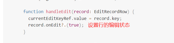
function handleEdit(record: EditRecordRow) {
currentEditKeyRef.value = record.key;
record.onEdit?.(true);
}
function handleCancel(record: EditRecordRow) {
currentEditKeyRef.value = '';
record.onEdit?.(false, false);
}
async function handleSave(record: EditRecordRow) {
// 校验
msg.loading({ content: '正在保存...', duration: 0, key: 'saving' });
const valid = await record.onValid?.();
if (valid) {
try {
const data = cloneDeep(record.editValueRefs);
console.log(data);
//TODO 此处将数据提交给服务器保存
// ...
// 保存之后提交编辑状态
const pass = await record.onEdit?.(false, true);
if (pass) {
currentEditKeyRef.value = '';
}
msg.success({ content: '数据已保存', key: 'saving' });
} catch (error) {
msg.error({ content: '保存失败', key: 'saving' });
}
} else {
msg.error({ content: '请填写正确的数据', key: 'saving' });
}
}
function createActions(record: EditRecordRow, column: BasicColumn): ActionItem[] {
if (!record.editable) {
return [
{
label: '编辑',
disabled: currentEditKeyRef.value ? currentEditKeyRef.value !== record.key : false,
onClick: handleEdit.bind(null, record),
},
];
}
return [
{
label: '保存',
onClick: handleSave.bind(null, record, column),
},
{
label: '取消',
popConfirm: {
title: '是否取消编辑',
confirm: handleCancel.bind(null, record, column),
},
},
];
}
function onEditChange({ column, value, record }) {
// 本例
if (column.dataIndex === 'id') {
record.editValueRefs.name4.value = `${value}`;
}
console.log(column, value, record);
}
return {
registerTable,
handleEdit,
createActions,
onEditChange,
};
},
});
</script>
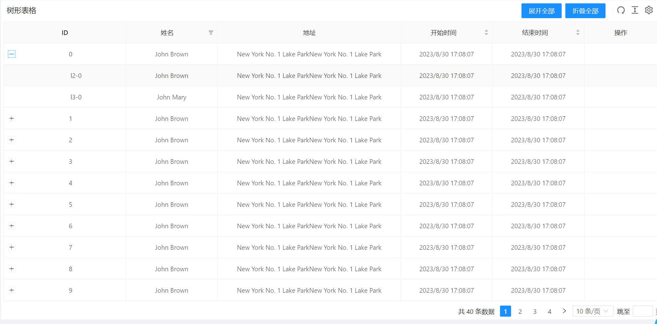
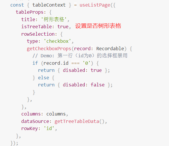
8.树形表格
本例演示:表格支持树形数据的展示
- 页面效果
- 示例代码
<template>
<div class="p-4">
<BasicTable @register="register">
<template #toolbar>
<a-button type="primary" @click="expandAll">展开全部</a-button>
<a-button type="primary" @click="collapseAll">折叠全部</a-button>
</template>
</BasicTable>
</div>
</template>
<script lang="ts">
import { defineComponent } from 'vue';
import { BasicColumn, BasicTable } from '/@/components/Table';
import { useListPage } from '/@/hooks/system/useListPage';
const columns: BasicColumn[] = [
{
title: 'ID',
dataIndex: 'id',
fixed: 'left',
width: 200,
},
{
title: '姓名',
dataIndex: 'name',
width: 150,
filters: [
{ text: 'Male', value: 'male' },
{ text: 'Female', value: 'female' },
],
},
{
title: '地址',
dataIndex: 'address',
width: 300,
},
{
title: '编号',
dataIndex: 'no',
width: 150,
sorter: true,
defaultHidden: true,
},
{
title: '开始时间',
width: 150,
sorter: true,
dataIndex: 'beginTime',
},
{
title: '结束时间',
width: 150,
sorter: true,
dataIndex: 'endTime',
},
];
export default defineComponent({
components: { BasicTable },
setup() {
const { tableContext } = useListPage({
tableProps: {
title: '树形表格',
isTreeTable: true,
rowSelection: {
type: 'checkbox',
getCheckboxProps(record: Recordable) {
// Demo: 第一行(id为0)的选择框禁用
if (record.id === '0') {
return { disabled: true };
} else {
return { disabled: false };
}
},
},
columns: columns,
dataSource: getTreeTableData(),
rowKey: 'id',
},
});
//BasicTable绑定注册
const [register, { expandAll, collapseAll }] = tableContext;
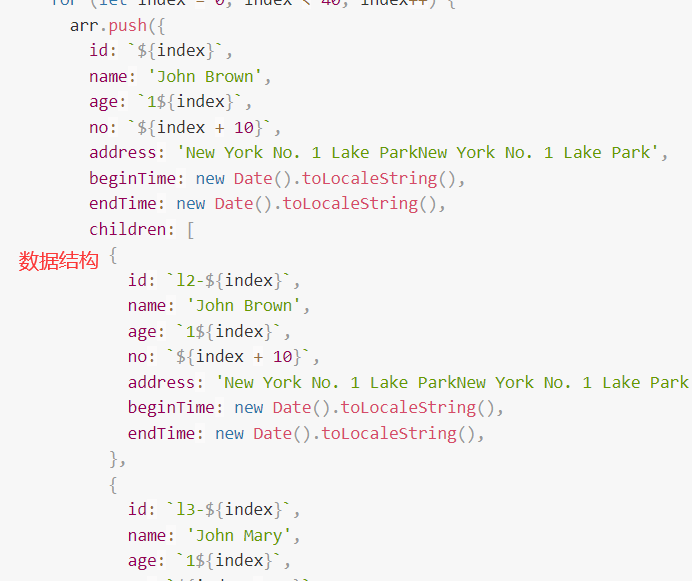
function getTreeTableData() {
const data: any = (() => {
const arr: any = [];
for (let index = 0; index < 40; index++) {
arr.push({
id: `${index}`,
name: 'John Brown',
age: `1${index}`,
no: `${index + 10}`,
address: 'New York No. 1 Lake ParkNew York No. 1 Lake Park',
beginTime: new Date().toLocaleString(),
endTime: new Date().toLocaleString(),
children: [
{
id: `l2-${index}`,
name: 'John Brown',
age: `1${index}`,
no: `${index + 10}`,
address: 'New York No. 1 Lake ParkNew York No. 1 Lake Park',
beginTime: new Date().toLocaleString(),
endTime: new Date().toLocaleString(),
},
{
id: `l3-${index}`,
name: 'John Mary',
age: `1${index}`,
no: `${index + 10}`,
address: 'New York No. 1 Lake ParkNew York No. 1 Lake Park',
beginTime: new Date().toLocaleString(),
endTime: new Date().toLocaleString(),
},
],
});
}
return arr;
})();
return data;
}
return { register, expandAll, collapseAll };
},
});
</script>
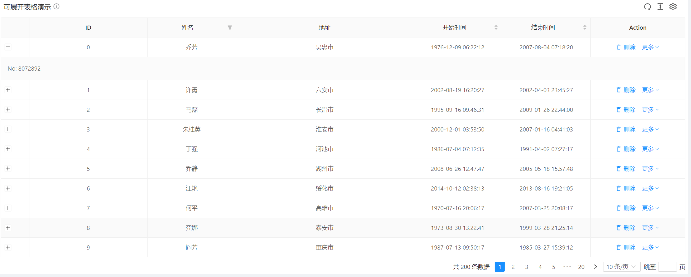
9.可展开行
本例演示:当表格内容较多不能一次性完全展示时,可以使用展开行来解决。
- 页面效果
- 示例代码

<template>
<PageWrapper
title="可展开表格"
content="不可与scroll共用。TableAction组件可配置stopButtonPropagation来阻止操作按钮的点击事件冒泡,以便配合Table组件的expandRowByClick"
>
<BasicTable @register="registerTable">
<template #expandedRowRender="{ record }">
<span>No: {{ record.no }} </span>
</template>
<template #action="{ record }">
<TableAction
stopButtonPropagation
:actions="[
{
label: '删除',
icon: 'ic:outline-delete-outline',
onClick: handleDelete.bind(null, record),
},
]"
:dropDownActions="[
{
label: '启用',
popConfirm: {
title: '是否启用?',
confirm: handleOpen.bind(null, record),
},
},
]"
/>
</template>
</BasicTable>
</PageWrapper>
</template>
<script lang="ts">
import { defineComponent } from 'vue';
import { BasicTable, useTable, TableAction, BasicColumn } from '/@/components/Table';
import { PageWrapper } from '/@/components/Page';
import { demoListApi } from '/@/api/demo/table';
import {useListPage} from "/@/hooks/system/useListPage";
const columns: BasicColumn[] = [
{
title: 'ID',
dataIndex: 'id',
fixed: 'left',
width: 200,
},
{
title: '姓名',
dataIndex: 'name',
width: 150,
filters: [
{ text: 'Male', value: 'male' },
{ text: 'Female', value: 'female' },
],
},
{
title: '地址',
dataIndex: 'address',
width: 300,
},
{
title: '编号',
dataIndex: 'no',
width: 150,
sorter: true,
defaultHidden: true,
},
{
title: '开始时间',
width: 150,
sorter: true,
dataIndex: 'beginTime',
},
{
title: '结束时间',
width: 150,
sorter: true,
dataIndex: 'endTime',
},
];
export default defineComponent({
components: { BasicTable, TableAction, PageWrapper },
setup() {
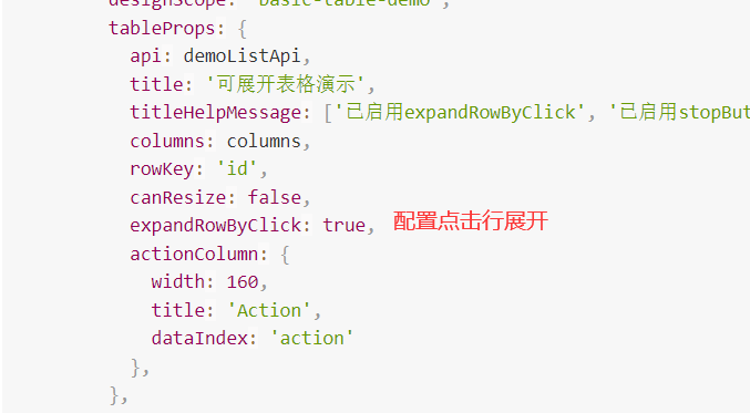
const { tableContext } = useListPage({
designScope: 'basic-table-demo',
tableProps: {
api: demoListApi,
title: '可展开表格演示',
titleHelpMessage: ['已启用expandRowByClick', '已启用stopButtonPropagation'],
columns: columns,
rowKey: 'id',
canResize: false,
expandRowByClick: true,
actionColumn: {
width: 160,
title: 'Action',
dataIndex: 'action'
},
},
});
//BasicTable绑定注册
const [registerTable] = tableContext;
function handleDelete(record: Recordable) {
console.log('点击了删除', record);
}
function handleOpen(record: Recordable) {
console.log('点击了启用', record);
}
return {
registerTable,
handleDelete,
handleOpen,
};
},
});
</script>
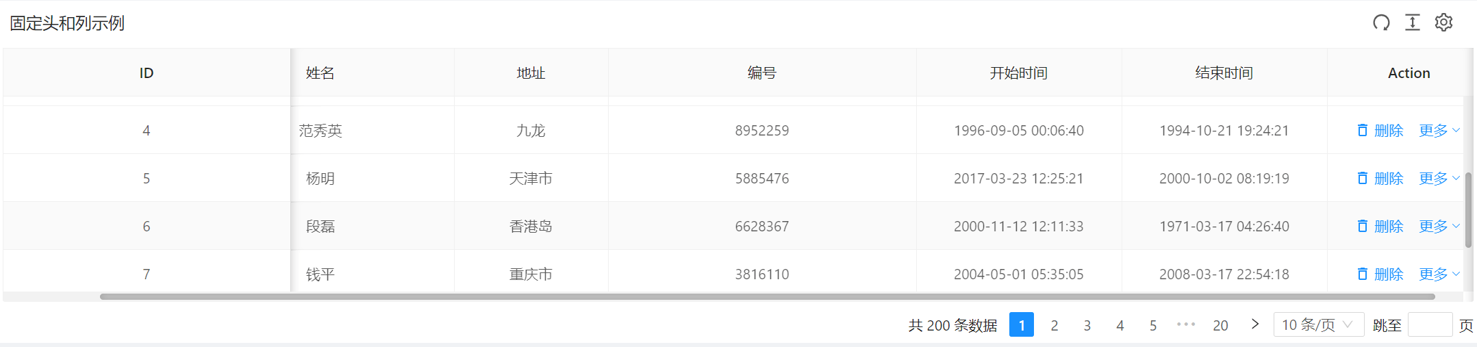
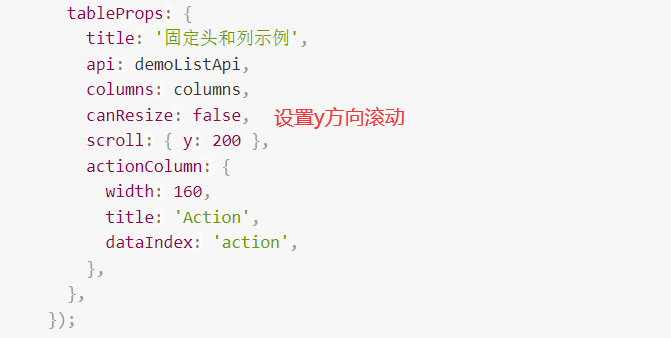
10.固定头和列
本例演示:怎样固定头和列,适合同时需要展示有大量数据和数据列。
- 页面效果
- 示例代码
<template>
<div class="p-4">
<BasicTable @register="registerTable">
<template #action="{ record }">
<TableAction
:actions="[
{
label: '删除',
icon: 'ic:outline-delete-outline',
onClick: handleDelete.bind(null, record),
},
]"
:dropDownActions="[
{
label: '启用',
popConfirm: {
title: '是否启用?',
confirm: handleOpen.bind(null, record),
},
},
]"
/>
</template>
</BasicTable>
</div>
</template>
<script lang="ts">
import { defineComponent } from 'vue';
import { BasicTable, useTable, BasicColumn, TableAction } from '/@/components/Table';
import { demoListApi } from '/@/api/demo/table';
import { useListPage } from '/@/hooks/system/useListPage';
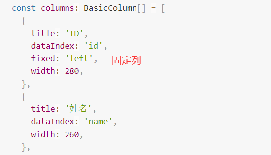
const columns: BasicColumn[] = [
{
title: 'ID',
dataIndex: 'id',
fixed: 'left',
width: 280,
},
{
title: '姓名',
dataIndex: 'name',
width: 260,
},
{
title: '地址',
dataIndex: 'address',
},
{
title: '编号',
dataIndex: 'no',
width: 300,
},
{
title: '开始时间',
width: 200,
dataIndex: 'beginTime',
},
{
title: '结束时间',
dataIndex: 'endTime',
width: 200,
},
];
export default defineComponent({
components: { BasicTable, TableAction },
setup() {
const { tableContext } = useListPage({
tableProps: {
title: '固定头和列示例',
api: demoListApi,
columns: columns,
canResize: false,
scroll: { y: 200 },
actionColumn: {
width: 160,
title: 'Action',
dataIndex: 'action',
},
},
});
//BasicTable绑定注册
const [registerTable] = tableContext;
function handleDelete(record: Recordable) {
console.log('点击了删除', record);
}
function handleOpen(record: Recordable) {
console.log('点击了启用', record);
}
return {
registerTable,
handleDelete,
handleOpen,
};
},
});
</script>
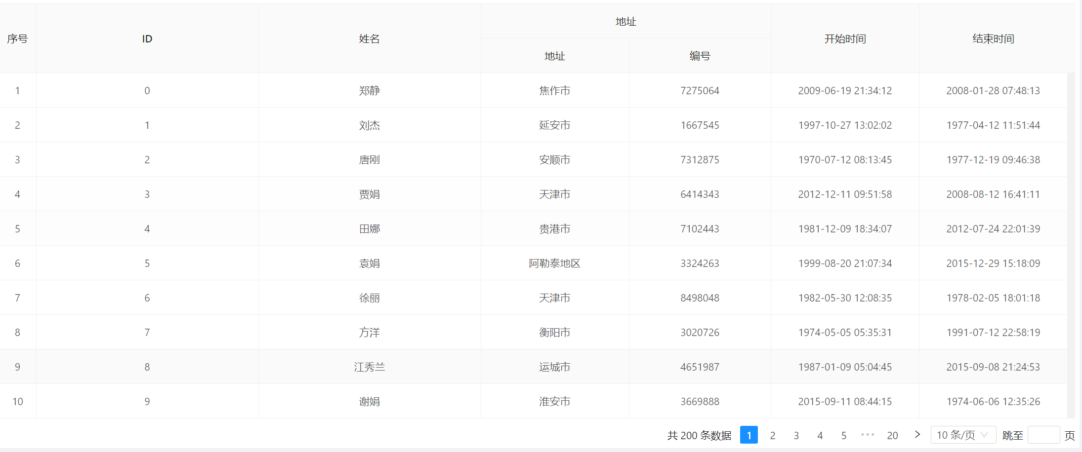
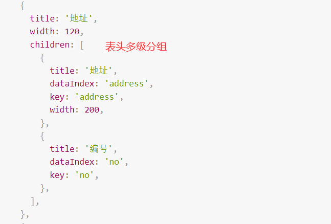
11.分组表头
本例演示:怎样自定义渲染多级分组表头。
- 页面效果
- 示例代码
<template>
  <div class="p-4">
    <BasicTable @register="registerTable" />
  </div>
</template>
<script lang="ts">
  import { defineComponent } from 'vue';
  import { BasicColumn, BasicTable } from '/@/components/Table';
  import { useListPage } from '/@/hooks/system/useListPage';
  import { demoListApi } from '/@/api/demo/table';

  //计算合并表头
  export default defineComponent({
    components: { BasicTable },
    setup() {

   // 列表页面公共参数、方法
      const { tableContext } = useListPage({
        tableProps: {
           title: '分组表头示例',
            api: demoListApi,
            columns: getMergeHeaderColumns(),
        },
      });

      //BasicTable绑定注册
      const [registerTable] = tableContext;

      function getMergeHeaderColumns(): BasicColumn[] {
        return [
          {
            title: 'ID',
            dataIndex: 'id',
            width: 300,
          },
          {
            title: '姓名',
            dataIndex: 'name',
            width: 300,
          },
          {
            title: '地址',
            width: 120,
            children: [
              {
                title: '地址',
                dataIndex: 'address',
                key: 'address',
                width: 200,
              },
              {
                title: '编号',
                dataIndex: 'no',
                key: 'no',
              },
            ],
          },
          {
            title: '开始时间',
            dataIndex: 'beginTime',
            width: 200,
          },
          {
            title: '结束时间',
            dataIndex: 'endTime',
            width: 200,
          },
        ];
      }
      return {
        registerTable,
      };
    },
  });
</script>
12.嵌套子表格
本例演示:怎样嵌套子表数据,展示每行数据的子表的信息。
- 页面效果
- 示例代码

<template>
  <BasicTable @register="registerTable" class="components-table-demo-nested">
    <template #bodyCell="{ column }">
      <template v-if="column.key === 'operation'">
        <a>Publish</a>
      </template>
    </template>
    <template #expandedRowRender>
      <a-table :columns="innerColumns" :data-source="innerData" :pagination="false">
        <template #bodyCell="{ column }">
          <template v-if="column.dataIndex === 'state'">
            <span>
              <a-badge status="success" />
              Finished
            </span>
          </template>
          <template v-if="column.dataIndex === 'operation'">
            <span class="table-operation">
              <a>Pause</a>
              <a>Stop</a>
              <a-dropdown>
                <template #overlay>
                  <a-menu>
                    <a-menu-item>Action 1</a-menu-item>
                    <a-menu-item>Action 2</a-menu-item>
                  </a-menu>
                </template>
                <a> More </a>
              </a-dropdown>
            </span>
          </template>
        </template>
      </a-table>
    </template>
  </BasicTable>
</template>
<script lang="ts">
  import { defineComponent } from 'vue';
  import { BasicTable } from '/@/components/Table';
  import { useListPage } from '/@/hooks/system/useListPage';

  const columns = [
    { title: 'Name', dataIndex: 'name', key: 'name' },
    { title: 'Platform', dataIndex: 'platform', key: 'platform' },
    { title: 'Version', dataIndex: 'version', key: 'version' },
    { title: 'Upgraded', dataIndex: 'upgradeNum', key: 'upgradeNum' },
    { title: 'Creator', dataIndex: 'creator', key: 'creator' },
    { title: 'Date', dataIndex: 'createdAt', key: 'createdAt' },
    { title: 'Action', key: 'operation' },
  ];

  interface DataItem {
    key: number;
    name: string;
    platform: string;
    version: string;
    upgradeNum: number;
    creator: string;
    createdAt: string;
  }

  const data: DataItem[] = [];
  for (let i = 0; i < 3; ++i) {
    data.push({
      key: i,
      name: 'Screem',
      platform: 'iOS',
      version: '10.3.4.5654',
      upgradeNum: 500,
      creator: 'Jack',
      createdAt: '2014-12-24 23:12:00',
    });
  }

  const innerColumns = [
    { title: 'Date', dataIndex: 'date', key: 'date' },
    { title: 'Name', dataIndex: 'name', key: 'name' },
    { title: 'Status', dataIndex: 'state', key: 'state' },
    { title: 'Upgrade Status', dataIndex: 'upgradeNum', key: 'upgradeNum' },
    {
      title: 'Action',
      dataIndex: 'operation',
      key: 'operation',
    },
  ];

  interface innerDataItem {
    key: number;
    date: string;
    name: string;
    upgradeNum: string;
  }

  const innerData: innerDataItem[] = [];
  for (let i = 0; i < 3; ++i) {
    innerData.push({
      key: i,
      date: '2014-12-24 23:12:00',
      name: 'This is production name',
      upgradeNum: 'Upgraded: 56',
    });
  }

  export default defineComponent({
    components: { BasicTable },
    setup() {
      // 列表页面公共参数、方法
      const { tableContext } = useListPage({
        tableProps: {
          title: '内嵌表格',
          dataSource: data,
          columns: columns,
          showActionColumn: false,
          rowKey: 'key',
        },
      });

     //BasicTable绑定注册
      const [registerTable] = tableContext;
      return {
        data,
        columns,
        innerColumns,
        innerData,
        registerTable,
      };
    },
  });
</script>
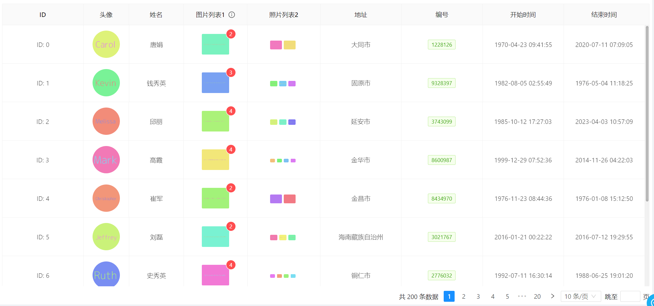
13.自定义列
本例演示:表格怎样自定义渲染 列的内容 和 列内容的展示效果
- 页面效果
- 示例代码
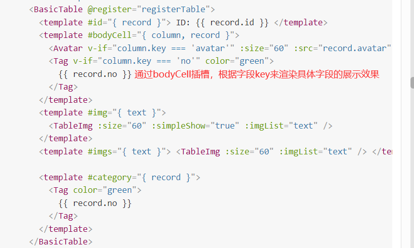
<template>
  <div class="p-4">
    <BasicTable @register="registerTable">
      <template #id="{ record }"> ID: {{ record.id }} </template>
      <template #bodyCell="{ column, record }">
        <Avatar v-if="column.key === 'avatar'" :size="60" :src="record.avatar" />
        <Tag v-if="column.key === 'no'" color="green">
          {{ record.no }}
        </Tag>
      </template>
      <template #img="{ text }">
        <TableImg :size="60" :simpleShow="true" :imgList="text" />
      </template>
      <template #imgs="{ text }"> <TableImg :size="60" :imgList="text" /> </template>

      <template #category="{ record }">
        <Tag color="green">
          {{ record.no }}
        </Tag>
      </template>
    </BasicTable>
  </div>
</template>
<script lang="ts">
  import { defineComponent } from 'vue';
  import { BasicTable, useTable, BasicColumn, TableImg } from '/@/components/Table';
  import { Tag, Avatar } from 'ant-design-vue';
  import { demoListApi } from '/@/api/demo/table';
  import { useListPage } from '/@/hooks/system/useListPage';
  const columns: BasicColumn[] = [
    {
      title: 'ID',
      dataIndex: 'id',
      slots: { customRender: 'id' },
    },
    {
      title: '头像',
      dataIndex: 'avatar',
      width: 100,
    },
    {
      title: '分类',
      dataIndex: 'category',
      width: 80,
      align: 'center',
      defaultHidden: true,
      slots: { customRender: 'category' },
    },
    {
      title: '姓名',
      dataIndex: 'name',
      width: 120,
    },
    {
      title: '图片列表1',
      dataIndex: 'imgArr',
      helpMessage: ['这是简单模式的图片列表', '只会显示一张在表格中', '但点击可预览多张图片'],
      width: 140,
      slots: { customRender: 'img' },
    },
    {
      title: '照片列表2',
      dataIndex: 'imgs',
      width: 160,
      slots: { customRender: 'imgs' },
    },
    {
      title: '地址',
      dataIndex: 'address',
    },
    {
      title: '编号',
      dataIndex: 'no',
    },
    {
      title: '开始时间',
      dataIndex: 'beginTime',
    },
    {
      title: '结束时间',
      dataIndex: 'endTime',
    },
  ];
  export default defineComponent({
    components: { BasicTable, TableImg, Tag, Avatar },
    setup() {
      const { tableContext } = useListPage({
        tableProps: {
          title: '自定义列内容',
          titleHelpMessage: '表格中所有头像、图片均为mock生成,仅用于演示图片占位',
          api: demoListApi,
          columns: columns,
          bordered: true,
          showTableSetting: false,
          showActionColumn: false,
        },
      });
      //注册table数据
      const [registerTable] = tableContext;
      return {
        registerTable,
      };
    },
  });
</script>
14.筛选和排序
本例演示:对某一列数据进行筛选,使用列的 filters 属性来指定需要筛选菜单的列, 对某一列数据进行排序,通过指定列的 sorter 函数即可启动排序按钮
- 页面效果
- 示例代码

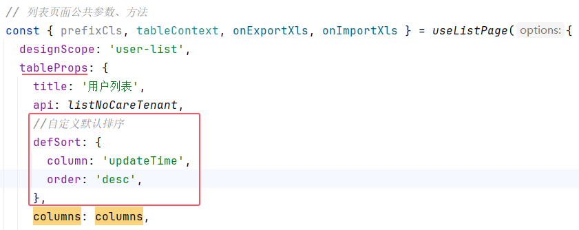
排序设置
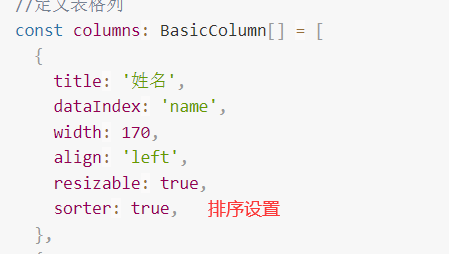
如果未进行排序,表格将按照创建时间以降序排列,您可以使用defSort修改默认排序
 //自定义默认排序
  defSort: {
    column: 'updateTime',
    order: 'desc',
  },
这是多字段默认排序示例,v3.8.3+ 支持此写法
    defSort: [
      {
        column: 'name',
        order: 'desc',
      },
      {
        column: 'sex',
        order: 'asc',
      },
    ],
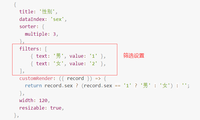
筛选设置
<template>
  <!--定义表格-->
  <BasicTable @register="registerTable">
    <!--操作栏-->
    <template #action="{ record }">
      <TableAction :actions="getTableAction(record)" />
    </template>
  </BasicTable>
</template>

<script lang="ts" name="basic-table-demo" setup>
  import { ActionItem, BasicColumn, BasicTable, TableAction } from '/@/components/Table';
  import { useListPage } from '/@/hooks/system/useListPage';
  import { defHttp } from '/@/utils/http/axios';
  //定义表格列
  const columns: BasicColumn[] = [
    {
      title: '姓名',
      dataIndex: 'name',
      width: 170,
      align: 'left',
      resizable: true,
      sorter: true,
    },
    {
      title: '关键词',
      dataIndex: 'keyWord',
      width: 130,
      resizable: true,
    },
    {
      title: '打卡时间',
      dataIndex: 'punchTime',
      width: 140,
      resizable: true,
    },
    {
      title: '工资',
      dataIndex: 'salaryMoney',
      width: 140,
      resizable: true,
      sorter: {
        multiple: 2,
      },
    },
    {
      title: '奖金',
      dataIndex: 'bonusMoney',
      width: 140,
      resizable: true,
    },
    {
      title: '性别',
      dataIndex: 'sex',
      sorter: {
        multiple: 3,
      },
      filters: [
          { text: '男', value: '1' },
          { text: '女', value: '2' },
      ],
      customRender: ({ record }) => {
        return record.sex ? (record.sex == '1' ? '男' : '女') : '';
      },
      width: 120,
      resizable: true,
    },
    {
      title: '生日',
      dataIndex: 'birthday',
      width: 120,
      resizable: true,
    },
    {
      title: '邮箱',
      dataIndex: 'email',
      width: 120,
      resizable: true,
    },
  ];
  //ajax请求api接口
  const demoListApi = (params) => {
    return defHttp.get({ url: '/test/jeecgDemo/list', params });
  };
  // 列表页面公共参数、方法
  const { tableContext } = useListPage({
    designScope: 'basic-table-demo-filter',
    tableProps: {
      title: '用户列表',
      api: demoListApi,
      columns: columns,
      showActionColumn:false
    },
  });
  //注册table数据
  const [registerTable] = tableContext;
  /**
   * 操作栏
   */
  function getTableAction(record): ActionItem[] {
    return [
      {
        label: '编辑',
        onClick: handleEdit.bind(null, record),
      },
    ];
  }

  function handleEdit(record) {
    console.log(record);
  }
</script>
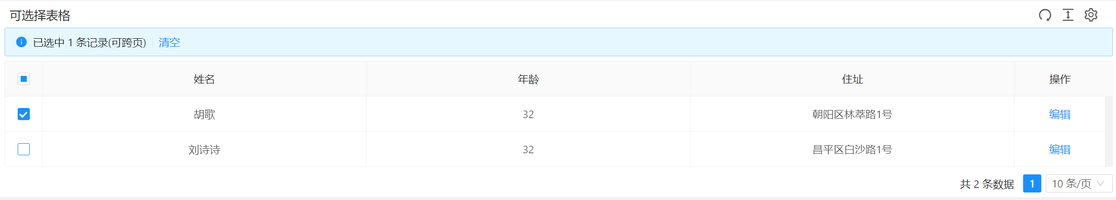
15.选择和操作
本例演示:如何配置选择列和操作列。并通过 selectedRows 或者 selectedRowKeys 来操作选中项。通过配置rowSelection.type 设置单选 或 多选
- 页面效果
- 示例代码
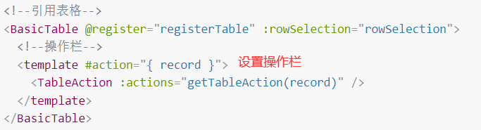
<template>
<!--定义表格,绑定rowSelection选择行属性-->
<BasicTable @register="registerTable" :rowSelection="rowSelection">
<!--操作栏-->
<template #action="{ record }">
<TableAction :actions="getTableAction(record)" />
</template>
</BasicTable>
</template>
<script lang="ts" name="basic-table-demo" setup>
import { BasicColumn, BasicTable, TableAction } from '/@/components/Table';
import { useListPage } from '/@/hooks/system/useListPage';
//定义表格列
const columns: BasicColumn[] = [
{
title: '姓名',
dataIndex: 'name',
key: 'name',
resizable: true,
},
{
title: '年龄',
dataIndex: 'age',
key: 'age',
},
{
title: '住址',
dataIndex: 'address',
key: 'address',
},
];
// 列表页面公共参数、方法
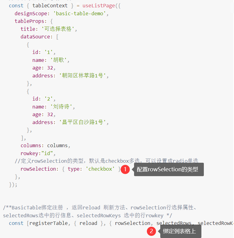
const { tableContext } = useListPage({
designScope: 'basic-table-demo',
tableProps: {
title: '可选择表格',
dataSource: [
{
id: '1',
name: '胡歌',
age: 32,
address: '朝阳区林萃路1号',
},
{
id: '2',
name: '刘诗诗',
age: 32,
address: '昌平区白沙路1号',
},
],
columns: columns,
rowkey:"id",
//定义rowSelection的类型,默认是checkbox多选,可以设置成radio单选
rowSelection: { type: 'checkbox' },
},
});
/**BasicTable绑定注册 ,返回reload 刷新方法、rowSelection行选择属性、
selectedRows选中的行信息、selectedRowKeys 选中的行rowkey */
const [registerTable, { reload }, { rowSelection, selectedRows, selectedRowKeys }] = tableContext;
/**
* 操作栏设置,可配置编辑、删除等各种操作方式,其他使用方式参考文档中的 `内置组件`内容
*/
function getTableAction(record): ActionItem[] {
return [
{
label: '编辑',
onClick: handleEdit.bind(null, record),
},
];
}
function handleEdit(record) {
console.log(record);
console.log(selectedRows.value);
console.log(selectedRowKeys.value);
}
</script>
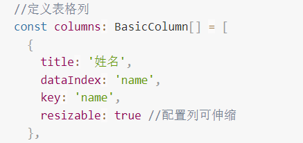
16.可伸缩列
本例演示:设置 列开启拖动 resizable 属性 ,鼠标 移到到 列后的分割线上拖动
- 页面效果
- 示例代码

<template>
  <!--定义表格-->
  <BasicTable @register="registerTable">
    <!--操作栏-->
    <template #action="{ record }">
      <TableAction :actions="getTableAction(record)" />
    </template>
  </BasicTable>
</template>

<script lang="ts" name="basic-table-demo" setup>
  import { ActionItem, BasicColumn, BasicTable, TableAction } from '/@/components/Table';
  import { useListPage } from '/@/hooks/system/useListPage';
  //定义表格列
  const columns: BasicColumn[] = [
    {
      title: '姓名',
      dataIndex: 'name',
      key: 'name',
      resizable: true //配置列可伸缩
    },
    {
      title: '年龄',
      dataIndex: 'age',
      key: 'age',
    },
    {
      title: '住址',
      dataIndex: 'address',
      key: 'address',

    },
  ];
  // 列表页面公共参数、方法
  const { tableContext } = useListPage({
    designScope: 'basic-table-demo',
    tableProps: {
      title: '可伸缩列',
      dataSource: [
        {
          key: '1',
          name: '胡歌',
          age: 32,
          address: '朝阳区林萃路1号',
        },
        {
          key: '2',
          name: '刘诗诗',
          age: 32,
          address: '昌平区白沙路1号',
        },
      ],
      columns: columns,
      showActionColumn: false
    },
  });


  //BasicTable绑定注册
  const [registerTable] = tableContext;
  /**
   * 操作栏
   */
  function getTableAction(record): ActionItem[] {
    return [
      {
        label: '编辑',
        onClick: handleEdit.bind(null, record),
      },
    ];
  }

  function handleEdit(record) {
    console.log(record);
  }
</script>
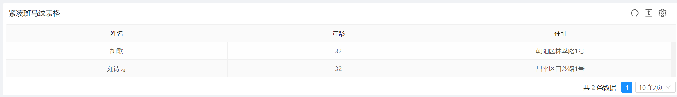
17.紧凑和斑马纹表格
本例演示:通过size来设置表格的大小,striped来设置是否显示为斑马纹
- 页面效果
- 示例代码
表格大小

斑马纹

<template>
  <!--引用表格-->
  <BasicTable @register="registerTable">
    <!--操作栏-->
    <template #action="{ record }">
      <TableAction :actions="getTableAction(record)" />
    </template>
  </BasicTable>
</template>

<script lang="ts" name="basic-table-demo" setup>
  import { ActionItem, BasicColumn, BasicTable, TableAction } from '/@/components/Table';
  import { useListPage } from '/@/hooks/system/useListPage';
  //定义表格列
  const columns: BasicColumn[] = [
    {
      title: '姓名',
      dataIndex: 'name',
      key: 'name',
      resizable: true
    },
    {
      title: '年龄',
      dataIndex: 'age',
      key: 'age',
    },
    {
      title: '住址',
      dataIndex: 'address',
      key: 'address',

    },
  ];
  // 列表页面公共参数、方法
  const { tableContext } = useListPage({
    designScope: 'basic-table-demo',
    tableProps: {
      title: '紧凑斑马纹表格',
      dataSource: [
        {
          key: '1',
          name: '胡歌',
          age: 32,
          address: '朝阳区林萃路1号',
        },
        {
          key: '2',
          name: '刘诗诗',
          age: 32,
          address: '昌平区白沙路1号',
        },
      ],
      columns: columns,
      size:'small',//紧凑型表格
      striped:true,//斑马纹设置
      showActionColumn: false
    },
  });
  //注册table数据
  const [registerTable] = tableContext;
  /**
   * 操作栏
   */
  function getTableAction(record): ActionItem[] {
    return [
      {
        label: '编辑',
        onClick: handleEdit.bind(null, record),
      },
    ];
  }

  function handleEdit(record) {
    console.log(record);
  }
</script>
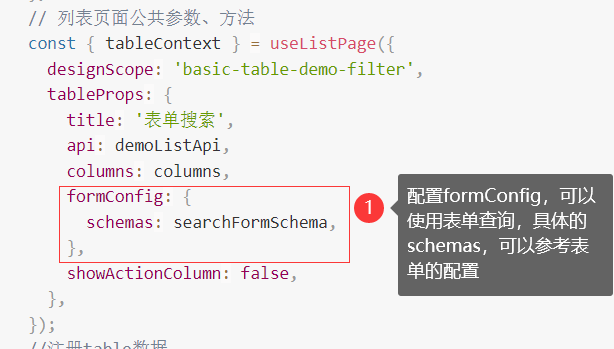
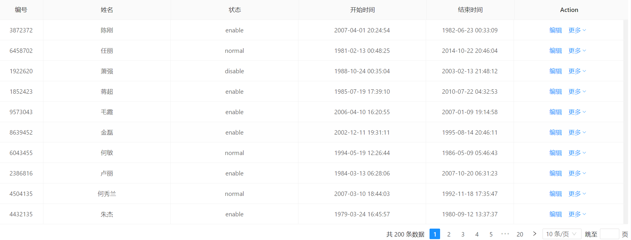
18.开启表单搜索
本例演示:怎样配置表格表单查询,可在表格上方显示表单搜索,具体表单配置参考Form 表单组件
- 页面效果
- 示例代码


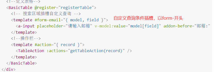
<template>
<div class="p-4">
<!--定义表格-->
<BasicTable @register="registerTable">
<!-- 搜索区域插槽自定义查询 -->
<template #form-email="{ model, field }">
<a-input placeholder="请输入邮箱" v-model:value="model[field]" addon-before="邮箱:" addon-after=".com"></a-input>
</template>
<!--操作栏-->
<template #action="{ record }">
<TableAction :actions="getTableAction(record)" />
</template>
</BasicTable>
</div>
</template>
<script lang="ts" name="basic-table-demo" setup>
import { ActionItem, BasicColumn, BasicTable, FormSchema, TableAction } from '/@/components/Table';
import { useListPage } from '/@/hooks/system/useListPage';
import { defHttp } from '/@/utils/http/axios';
//定义表格列
const columns: BasicColumn[] = [
{
title: '姓名',
dataIndex: 'name',
width: 170,
align: 'left',
resizable: true,
sorter: {
multiple: 1,
},
},
{
title: '关键词',
dataIndex: 'keyWord',
width: 130,
resizable: true,
},
{
title: '打卡时间',
dataIndex: 'punchTime',
width: 140,
resizable: true,
},
{
title: '工资',
dataIndex: 'salaryMoney',
width: 140,
resizable: true,
sorter: {
multiple: 2,
},
},
{
title: '奖金',
dataIndex: 'bonusMoney',
width: 140,
resizable: true,
},
{
title: '性别',
dataIndex: 'sex',
sorter: {
multiple: 3,
},
filters: [
{ text: '男', value: '1' },
{ text: '女', value: '2' },
],
customRender: ({ record }) => {
return record.sex ? (record.sex == '1' ? '男' : '女') : '';
},
width: 120,
resizable: true,
},
{
title: '生日',
dataIndex: 'birthday',
width: 120,
resizable: true,
},
{
title: '邮箱',
dataIndex: 'email',
width: 120,
resizable: true,
},
];
//表单搜索字段
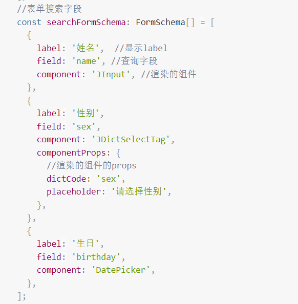
const searchFormSchema: FormSchema[] = [
{
label: '姓名', //显示label
field: 'name', //查询字段
component: 'JInput', //渲染的组件
defaultValue: '苏榕润', //设置默认值
},
{
label: '性别',
field: 'sex',
component: 'JDictSelectTag',
componentProps: {
//渲染的组件的props
dictCode: 'sex',
placeholder: '请选择性别',
},
},
{
label: '邮箱',
field: 'email',
component: 'JInput',
slot: 'email',
},
{
label: '生日',
field: 'birthday',
component: 'DatePicker',
},
];
//ajax请求api接口
const demoListApi = (params) => {
return defHttp.get({ url: '/test/jeecgDemo/list', params });
};
// 列表页面公共参数、方法
const { tableContext } = useListPage({
designScope: 'basic-table-demo-filter',
tableProps: {
title: '表单搜索',
api: demoListApi,
columns: columns,
formConfig: {
schemas: searchFormSchema,
}
},
});
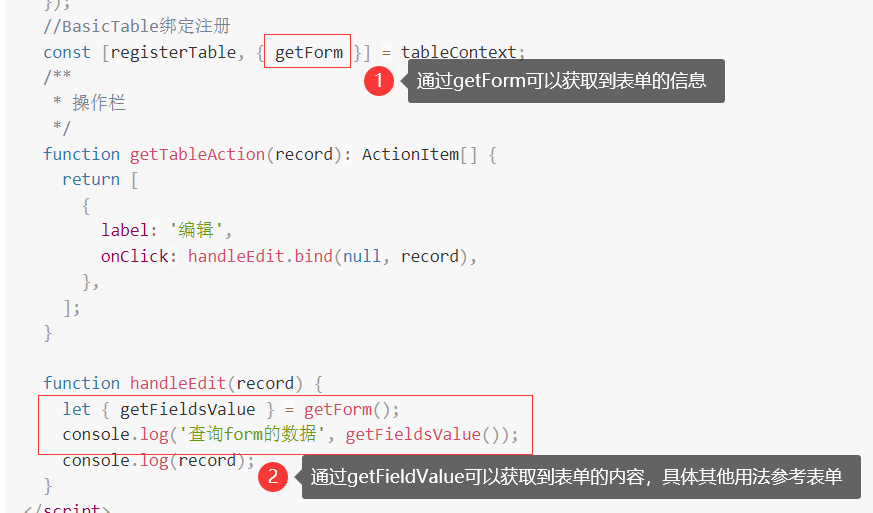
//BasicTable绑定注册
const [registerTable, { getForm }] = tableContext;
/**
* 操作栏
*/
function getTableAction(record): ActionItem[] {
return [
{
label: '编辑',
onClick: handleEdit.bind(null, record),
},
];
}
function handleEdit(record) {
let { getFieldsValue } = getForm();
console.log('查询form的数据', getFieldsValue());
console.log(record);
}
</script>
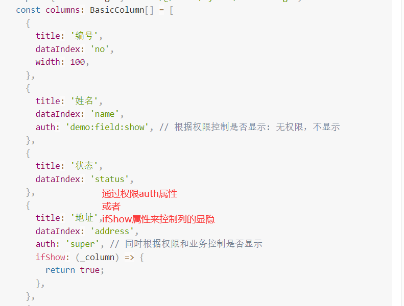
19.权限列
可以通过配置 auth 或者 ifshow 控制列的显隐
- 页面效果
- 示例代码
<template>
  <div class="p-4">
    <BasicTable @register="registerTable">
      <template #action="{ record }">
        <TableAction
          :actions="[
            {
              label: '编辑',
              onClick: handleEdit.bind(null, record),
              auth: 'demo:field:show', // 根据权限控制是否显示: 无权限,不显示
            },
            {
              label: '删除',
              icon: 'ic:outline-delete-outline',
              onClick: handleDelete.bind(null, record),
              auth: 'super', // 根据权限控制是否显示: 有权限,会显示
            },
          ]"
          :dropDownActions="[
            {
              label: '启用',
              popConfirm: {
                title: '是否启用?',
                confirm: handleOpen.bind(null, record),
              },
              ifShow: (_action) => {
                return record.status !== 'enable'; // 根据业务控制是否显示: 非enable状态的不显示启用按钮
              },
            },
            {
              label: '禁用',
              popConfirm: {
                title: '是否禁用?',
                confirm: handleOpen.bind(null, record),
              },
              ifShow: () => {
                return record.status === 'enable'; // 根据业务控制是否显示: enable状态的显示禁用按钮
              },
            },
            {
              label: '同时控制',
              popConfirm: {
                title: '是否动态显示?',
                confirm: handleOpen.bind(null, record),
              },
              auth: 'super', // 同时根据权限和业务控制是否显示
              ifShow: () => {
                return true;
              },
            },
          ]"
        />
      </template>
    </BasicTable>
  </div>
</template>
<script lang="ts">
  import { defineComponent } from 'vue';
  import { BasicTable, useTable, BasicColumn, TableAction } from '/@/components/Table';

  import { demoListApi } from '/@/api/demo/table';
  import { useListPage } from '/@/hooks/system/useListPage';
  const columns: BasicColumn[] = [
    {
      title: '编号',
      dataIndex: 'no',
      width: 100,
    },
    {
      title: '姓名',
      dataIndex: 'name',
      auth: 'demo:field:show', // 根据权限控制是否显示: 无权限,不显示
    },
    {
      title: '状态',
      dataIndex: 'status',
    },
    {
      title: '地址',
      dataIndex: 'address',
      auth: 'super', // 同时根据权限和业务控制是否显示
      ifShow: (_column) => {
        return true;
      },
    },
    {
      title: '开始时间',
      dataIndex: 'beginTime',
    },
    {
      title: '结束时间',
      dataIndex: 'endTime',
      width: 200,
    },
  ];
  export default defineComponent({
    components: { BasicTable, TableAction },
    setup() {
      const { tableContext } = useListPage({
        tableProps: {
          title: '权限列',
          api: demoListApi,
          columns: columns,
          bordered: true,
          actionColumn: {
            width: 250,
            title: 'Action',
            dataIndex: 'action',
            slots: { customRender: 'action' },
          },
        },
      });

      //BasicTable绑定注册
      const [registerTable] = tableContext;

      function handleEdit(record: Recordable) {
        console.log('点击了编辑', record);
      }
      function handleDelete(record: Recordable) {
        console.log('点击了删除', record);
      }
      function handleOpen(record: Recordable) {
        console.log('点击了启用', record);
      }
      return {
        registerTable,
        handleEdit,
        handleDelete,
        handleOpen,
      };
    },
  });
</script>
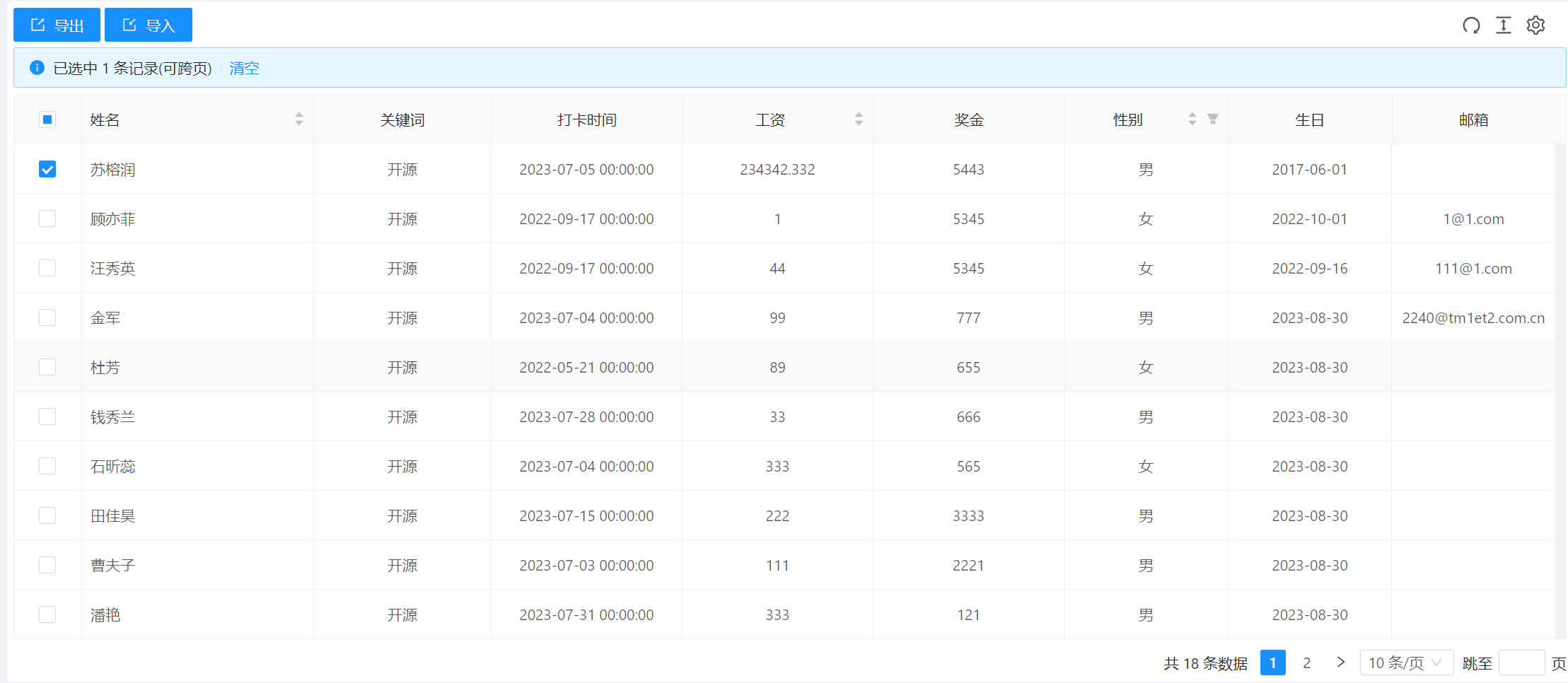
20.导入导出
本例演示:怎样配置导入导出表格数据,需要结合后端接口实现。
- 页面效果
- 示例代码
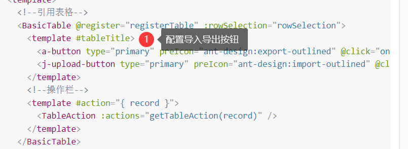
<template>
<!--定义表格-->
<BasicTable @register="registerTable" :rowSelection="rowSelection">
<template #tableTitle>
<a-button type="primary" preIcon="ant-design:export-outlined" @click="onExportXls"> 导出</a-button>
<j-upload-button type="primary" preIcon="ant-design:import-outlined" @click="onImportXls">导入</j-upload-button>
</template>
<!--操作栏-->
<template #action="{ record }">
<TableAction :actions="getTableAction(record)" />
</template>
</BasicTable>
</template>
<script lang="ts" name="basic-table-demo" setup>
import { ActionItem, BasicColumn, BasicTable, TableAction } from '/@/components/Table';
import { useListPage } from '/@/hooks/system/useListPage';
import { defHttp } from '/@/utils/http/axios';
//定义表格列
const columns: BasicColumn[] = [
{
title: '姓名',
dataIndex: 'name',
width: 170,
align: 'left',
resizable: true,
sorter: {
multiple: 1,
},
},
{
title: '关键词',
dataIndex: 'keyWord',
width: 130,
resizable: true,
},
{
title: '打卡时间',
dataIndex: 'punchTime',
width: 140,
resizable: true,
},
{
title: '工资',
dataIndex: 'salaryMoney',
width: 140,
resizable: true,
sorter: {
multiple: 2,
},
},
{
title: '奖金',
dataIndex: 'bonusMoney',
width: 140,
resizable: true,
},
{
title: '性别',
dataIndex: 'sex',
sorter: {
multiple: 3,
},
filters: [
{ text: '男', value: '1' },
{ text: '女', value: '2' },
],
customRender: ({ record }) => {
return record.sex ? (record.sex == '1' ? '男' : '女') : '';
},
width: 120,
resizable: true,
},
{
title: '生日',
dataIndex: 'birthday',
width: 120,
resizable: true,
},
{
title: '邮箱',
dataIndex: 'email',
width: 120,
resizable: true,
},
];
//ajax请求api接口
const demoListApi = (params) => {
return defHttp.get({ url: '/test/jeecgDemo/list', params });
};
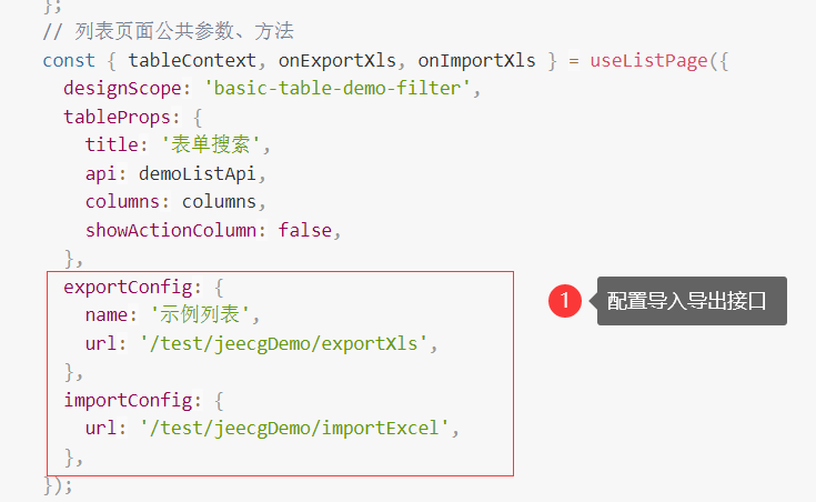
// 列表页面公共参数、方法
const { tableContext, onExportXls, onImportXls } = useListPage({
designScope: 'basic-table-demo-filter',
tableProps: {
title: '表单搜索',
api: demoListApi,
columns: columns,
showActionColumn: false,
},
exportConfig: {
name: '示例列表',
url: '/test/jeecgDemo/exportXls',
},
importConfig: {
url: '/test/jeecgDemo/importExcel',
},
});
//BasicTable绑定注册
const [registerTable, { reload }, { rowSelection, selectedRows, selectedRowKeys }] = tableContext;
/**
* 操作栏
*/
function getTableAction(record): ActionItem[] {
return [
{
label: '编辑',
onClick: handleEdit.bind(null, record),
},
];
}
function handleEdit(record) {
console.log(record);
}
</script>
21.表格合计
本例演示:怎样配置显示合计行以及合计列的计算。
- 页面效果
- 示例代码

<template>
<!--定义表格-->
<div class="p-4">
<BasicTable @register="registerTable" />
</div>
</template>
<script lang="ts" setup>
import { BasicTable } from '/@/components/Table';
import { mapTableTotalSummary } from '/@/utils/common/compUtils';
import { useListPage } from '/@/hooks/system/useListPage';
// 列表页面公共参数、方法
const { tableContext } = useListPage({
designScope: 'basic-table-demo',
tableProps: {
title: '合计表格',
rowKey: 'id',
bordered: true,
canResize: false,
useSearchForm: false,
showActionColumn: false,
showIndexColumn: true,
columns: [
{ title: '姓名', dataIndex: 'name' },
{ title: '贡献点', dataIndex: 'point' },
{ title: '等级', dataIndex: 'level' },
{ title: '更新时间', dataIndex: 'updateTime' },
],
dataSource: [
{ id: 0, name: '张三', point: 23, level: 3, updateTime: '2019-8-14' },
{ id: 1, name: '小鹿', point: 33, level: 9, updateTime: '2019-8-10' },
{ id: 2, name: '小王', point: 6, level: 1, updateTime: '2019-8-13' },
{ id: 3, name: '李四', point: 53, level: 8, updateTime: '2019-8-12' },
{ id: 4, name: '小红', point: 44, level: 5, updateTime: '2019-8-11' },
{ id: 5, name: '王五', point: 97, level: 10, updateTime: '2019-8-10' },
{ id: 6, name: '小明', point: 33, level: 2, updateTime: '2019-8-10' },
{ id: 7, name: '小张', point: 33, level: 4, updateTime: '2019-8-10' },
{ id: 8, name: '小六', point: 33, level: 2, updateTime: '2019-8-10' },
{ id: 9, name: '小五', point: 33, level: 7, updateTime: '2019-8-10' },
{ id: 10, name: '小赵', point: 33, level: 2, updateTime: '2019-8-10' },
{ id: 11, name: '李华', point: 33, level: 8, updateTime: '2019-8-10' },
{ id: 12, name: '小康', point: 33, level: 5, updateTime: '2019-8-10' },
],
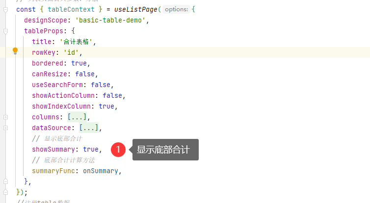
// 显示底部合计
showSummary: true,
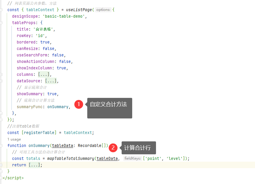
// 底部合计计算方法
summaryFunc: onSummary,
},
});
// BasicTable绑定注册
const [registerTable] = tableContext;
/**
* 计算合计
* @param tableData
*/
function onSummary(tableData: Recordable[]) {
// 可用工具方法自动计算合计
const totals = mapTableTotalSummary(tableData, ['point', 'level']);
console.log('onSummary****totals>>>', totals);
return [
totals,
{
_row: '平均',
_index: '平均',
// 计算平均值
point: (totals.point / tableData.length).toFixed(2),
level: (totals.level / tableData.length).toFixed(0),
},
];
}
</script>
API
TableProps
TableProps除了以下配置参数外,温馨提醒
Ant Design Vue 官方文档内的 表格props 也都支持,具体可以参考 antv table
| 参数 | 类型 | 默认值 | 说明 |
|---|---|---|---|
| autoCreateKey | boolean | true | 是否自动生成 key |
| api | (...arg: any) => Promise<any> | - | 请求接口,可以直接将src/api内的函数直接传入,具体使用和返回数据参考 2.远程加载数据示例 |
| afterFetch | (T)=>T | - | 请求之后对返回值进行处理 |
| actionColumn | any | - | 表格右侧操作列配置 BasicColumn |
| bordered | boolean | false | 是否显示表格边框 |
| beforeFetch | (T)=>T | - | 请求之前对参数进行处理 |
| beforeEditSubmit | ({record: Recordable,index: number,key: string | number,value: any}) => Promise<any> | - | 单元格编辑状态提交回调,返回false将阻止单元格提交数据到table。该回调在行编辑模式下无效。 |
| columns | any | - | 表单列信息 BasicColumn[] |
| canResize | boolean | true | 是否可以自适应高度(如果置于PageWrapper组件内,请勿启用PageWrapper的fixedHeight属性,二者不可同时使用) |
| clearSelectOnPageChange | boolean | false | 切换页码是否重置勾选状态 |
| clickToRowSelect | boolean | true | 点击行是否选中 checkbox 或者 radio。需要开启 |
| dataSource | any[] | - | 表格数据,非 api 加载情况 |
| defSort | Recordable | Recordable[] | - | 默认的排序参数 |
| ellipsis | boolean | true | 文本超过宽度是否显示... |
| emptyDataIsShowTable | boolean | true | 在启用搜索表单的前提下,是否在表格没有数据时显示表格 |
| fetchSetting | FetchSetting | - | 接口请求配置,可以配置请求的字段和响应字段名,见下方全局配置说明 |
| filterFn | (sortInfo: Partial<Recordable<string[]>>) => any | - | 自定义过滤方法。见下方全局配置说明 |
| formConfig | any | - | 表单配置,参考表单组件的 Props |
| handleSearchInfoFn | (T)=>T | - | 开启表单后,在请求之前处理搜索条件参数 |
| inset | boolean | false | 取消表格的默认 padding |
| isTreeTable | boolean | false | 是否树表 |
| immediate | boolean | true | 组件加载后是否立即请求接口,在 api 有传的情况下,如果为 false,需要自行使用 reload 加载表格数据 |
| indexColumnProps | any | - | 序号列配置 BasicColumn |
| loading | boolean | false | 表格 loading 状态 |
| minHeight | number | - | 表格最小高度 |
| maxHeight | number | - | 表格最大高度,超出会显示滚动条 |
| maxColumnWidth | number | - | 统一设置列最大宽度 |
| pagination | any | - | 分页信息配置,为 false 不显示分页 |
| rowKey | string | ((record: Recordable) => string) | - | 表格行 key 的取值,可以是字符串或一个函数 |
| resizeHeightOffset | number | 0 | 表格自适应高度计算结果会减去这个值 |
| rowSelection | any - | 选择列配置 | |
| sortFn | (sortInfo: SorterResult<any>) => any | - | 自定义排序方法。见下方全局配置说明 |
| showTableSetting | boolean | false | 显示表格设置工具 |
| striped | boolean | true | 斑马纹 |
| showSummary | boolean | false | 是否显示合计行 |
| summaryData | any[] | - | 自定义合计数据。如果有则显示该数据 |
| summaryFunc | (...arg) => any[] | - | 计算合计行的方法 |
| searchInfo | any | - | 额外的请求参数 |
| showIndexColumn | boolean | true | 是否显示序号列 |
| showActionColumn | boolean | - | 是否显示操作列 |
| scroll | any | - | 参考官方文档 scroll |
| tableSetting | TableSetting | - | 表格设置工具配置,见下方 TableSetting |
| title | string - | 表格标题 | |
| titleHelpMessage | string | string[] | - | 表格标题右侧温馨提醒 |
| useSearchForm | boolean | false | 使用搜索表单 |
TableSetting
{
  // 是否显示刷新按钮
  redo?: boolean;
  // 是否显示尺寸调整按钮
  size?: boolean;
  // 是否显示字段调整按钮
  setting?: boolean;
  // 是否显示全屏按钮
  fullScreen?: boolean;
  // 缓存“字段调整”配置的key,用于页面上有多个表格需要区分的情况(需唯一)
  cacheKey?: string;
}
fetchSetting
{
  // 传给后台的当前页字段
  pageField: 'pageNo',
  // 传给后台的每页显示多少条的字段
  sizeField: 'pageSize',
  // 接口返回表格数据的字段 (支持 a.b.c格式)
  listField: 'records',
  // 接口返回表格总数的字段(支持 a.b.c格式)
  totalField: 'total',
}
事件
除以下事件外,温馨提醒
Ant Design Vue 官方文档内的 event 也都支持,具体可以参考 antv table,事件的绑定和使用请参考 示例6.可编辑单元格
| 事件 | 回调参数 | 说明 |
|---|---|---|
edit-end | Function({record, index, key, value}) | 单元格编辑完成触发 |
edit-cancel | Function({record, index, key, value}) | 单元格取消编辑触发 |
edit-row-end | Function() | 行编辑结束触发 |
edit-change | Function({column,value,record}) | 单元格编辑组件的 value 发生变化时触发 |
fetch-success | Function({items,total}) | 接口请求成功后触发 |
fetch-error | Function(error) | 错误信息 |
row-click | Function(record, index, event) | 行点击触发 |
row-dbClick | Function(record, index, event) | 行双击触发 |
row-contextmenu | Function(record, index, event) | 行右键触发 |
row-mouseenter | Function(record, index, event) | 行移入触发 |
row-mouseleave | Function(record, index, event) | 行移出触发 |
selection-change | Function({keys,rows}) | 勾选事件触发 |
BasicColumn
除 参考官方 Column 配置外,扩展以下参数
| 属性 | 类型 | 默认值 | 可选值 | 说明 |
|---|---|---|---|---|
| auth | RoleEnum|RoleEnum[]|string|string[] | - | - | 根据权限编码来控制当前列是否显示 |
| defaultHidden | boolean | false | - | 默认隐藏,可在列配置显示 |
| edit | boolean | - | - | 是否开启单元格编辑 |
| editRow | boolean | - | - | 是否开启行编辑 |
| editable | boolean | false | - | 是否处于编辑状态 |
| editComponent | ComponentType | Input | - | 编辑组件 |
| editComponentProps | any | - | - | 对应编辑组件的 props |
| editRule | ((text: string, record: Recordable) => Promise<string>) | - | - | 对应编辑组件的表单校验 |
| editValueMap | (value: any) => string | - | - | 对应单元格值枚举 |
| format | CellFormat | - | - | 单元格格式化 |
| helpMessage | string|string[] | - | - | 列头右侧帮助文本 |
| ifShow | boolean | ((action: ActionItem) => boolean) | - | - | 根据业务状态来控制当前列是否显示 |
| onEditRow | ()=>void | - | - | 触发行编辑 |
参数 editComponent 的typescript类型是 EditComponentType
export type ComponentType =
  | 'ApiSelect'
  | 'Checkbox'
  | 'DatePicker'
  | 'Input'
  | 'InputNumber'
  | 'Select'
  | 'Switch'
  | 'TimePicker';
参数format 的typescript类型是 CellFormat
export type CellFormat =
  | string
  | ((text: string, record: Recordable, index: number) => string | number)
  | Map<string | number, any>;
Slots
除以下参数外,官方文档内的 slot 也都支持,具体可以参考 antv table温馨提醒
| 名称 | 说明 | 版本 |
|---|---|---|
| expandedRowRender | 展开行区域 | |
| headerTop | 表格顶部区域(标题上方) | 2.6.1 |
| tableTitle | 表格顶部左侧区域 | |
| toolbar | 表格顶部右侧区域 |
Form-Slots
当开启 form 表单后。以form-xxxx为前缀的 slot 会被视为 form 的 slot
xxxx 为 form 组件的 slot。具体参考 form 组件文档
e.g
form-submitBefore
内置组件(只能用于表格内部)
TableAction
用于表格右侧操作列渲染
Props
| 属性 | 类型 | 默认值 | 说明 | 版本 |
|---|---|---|---|---|
| actions | ActionItem[] | - | 右侧操作列按钮列表 | |
| dropDownActions | ActionItem[] | - | 右侧操作列更多下拉按钮列表 | |
| stopButtonPropagation | boolean | false | 是否阻止操作按钮的click事件冒泡 | 2.5.0 |
ActionItem
export interface ActionItem {
  // 按钮文本
  label: string;
  // 是否禁用
  disabled?: boolean;
  // 按钮颜色
  color?: 'success' | 'error' | 'warning';
  // 按钮类型
  type?: string;
  // button组件props
  props?: any;
  // 按钮图标
  icon?: string;
  // 气泡确认框
  popConfirm?: PopConfirm;
  // 是否显示分隔线,v2.0.0+
  divider?: boolean;
  // 根据权限编码来控制当前列是否显示,v2.4.0+
  auth?: RoleEnum | RoleEnum[] | string | string[];
  // 根据业务状态来控制当前列是否显示,v2.4.0+
  ifShow?: boolean | ((action: ActionItem) => boolean);
  // 点击回调
  onClick?: Fn;
  // Tooltip配置,2.5.3以上版本支持,可以配置为string,或者完整的tooltip属性
  tooltip?: string | TooltipProps
}
有关TooltipProps的说明,请参考tooltip
PopConfirm
export interface PopConfirm {
  title: string;
  okText?: string;
  cancelText?: string;
  confirm: Fn;
  cancel?: Fn;
  icon?: string;
}
TableImg
用于渲染单元格图片,支持图片预览
Props
| 属性 | 类型 | 默认值 | 可选值 | 说明 | 版本 |
|---|---|---|---|---|---|
| imgList | string[] | - | - | 图片地址列表 | |
| margin | number | 4 | - | 常规模式下的图片间距 | 2.5.0 |
| size | number | - | - | 图片大小 | |
| simpleShow | boolean | false | true/false | 简单显示模式(只显示第一张图片) | 2.5.0 |
| showBadge | boolean | true | true/false | 简单模式下是否显示计数Badge | 2.5.0 |
| srcPrefix | string | - | - | 在每一个图片src前插入的内容 | 2.5.0 |
Usage
用于调用 Table 内部方法及 table 参数配置
// 表格的props也可以直接注册到useTable内部
const [register, methods] = useTable(props);

或者

const { tableContext } = useListPage({
    tableProps: props
  });
//注册table数据
const [register,methods] = tableContext;
register
register 用于注册 useTable,如果需要使用useTable提供的 api,必须将 register 传入组件的 onRegister
<template>
  <BasicTable @register="register" />
</template>
<script>
  export default defineComponent({
    components: { BasicForm },
    setup() {
       const { tableContext } = useListPage({
        tableProps: {
          title: '普通表格',
          api: api ,//请求接口
          columns: columns,//表格列
          showActionColumn: false,//隐藏操作列
         ...其他tableProps配置
        },
      });

      //BasicTable绑定注册,methods包含的方法参考下方Methods的api
      const [register,methods] = tableContext;
      return { register };
    },
  });
</script>
Methods
| 方法名 | 类型 | 说明 |
|---|---|---|
| setProps | (props: Partial<BasicTableProps>) => void | 用于设置表格参数 |
| reload | (opt?: FetchParams) => Promise<void> | 刷新表格 |
| redoHeight | () => void | 重新计算表格高度 |
| setLoading | (loading: boolean) => void | 设置表格 loading 状态 |
| getDataSource | <T = Recordable>() => T[] | 获取表格数据 |
| getRawDataSource | <T = Recordable>() => T[] | 获取后端接口原始数据 |
| getColumns | (opt?: GetColumnsParams) => BasicColumn[] | 获取表头数据 |
| setColumns | (columns: BasicColumn[]|string[]) => void | 设置表头数据 |
| setTableData | <T = Recordable>(values: T[]) => vo | 设置表格数据 |
| setPagination | (info: Partial<PaginationProps>) => void | 设置分页信息 |
| deleteSelectRowByKey | (key: string) => void | 根据 key 删除取消选中行 |
| getSelectRowKeys | () => string[] | 获取选中的keys |
| getSelectRows | <T = Recordable>() => T[] | 获取选中的rows |
| setSelectedRowKeys | (rowKeys: string[]|number[]) => void | 设置选中行 |
| getPaginationRef | () =>PaginationProps|boolean | 获取当前分页信息 |
| getShowPagination | () => boolean | 获取当前是否显示分页 |
| setShowPagination | (show: boolean) => Promise\<void> | 设置当前是否显示分页 |
| getRowSelection | () => TableRowSelection<Recordable> | 获取勾选框信息 |
| updateTableData | (index: number, key: string, value: any)=>void | 更新表格数据 |
| updateTableDataRecord | (rowKey: string| number, record: Recordable) => Recordable | void |
| deleteTableDataRecord | (rowKey: string| number| string[] | number[]) => void | 根据唯一的rowKey 动态删除指定行的数据.可用于不刷新整个表格而局部更新数据 |
| insertTableDataRecord | (record: Recordable, index?: number) => Recordable | void |
| getForm | () => FormActionType | 如果开启了搜索区域。可以通过该函数获取表单对象函数进行操作 |
| expandAll | () => void | 展开树形表格 |
| collapseAll | () => void | 折叠树形表格 |
全局配置
在componentsSettings 可以配置全局参数。用于统一整个项目的风格。可以通过 props 传值覆盖