表单控件用法示例
表单内置许多组件,包括文本框、下拉框、多选框、单选框等组件,并支持自定义扩展
Ant Design Vue自带控件
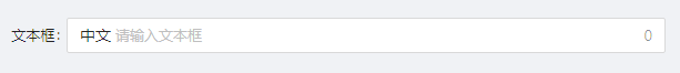
1. input输入框
- 页面效果
- 示例代码
const schemas: FormSchema[] = [
  {
    label: '文本框',
    field: 'name',
    component:'Input',
    //属性
    componentProps:{
      //前缀
      prefix:'中文',
      //是否显示字数
      showCount: true
    }
  },
]
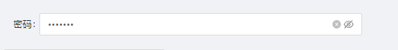
2. InputPassword密码输入框
- 页面效果
- 示例代码
const schemas: FormSchema[] = [
  {
    label: '密码',
    field: 'password',
    component:'InputPassword',
    //属性
    componentProps:{
      //是否显示切换按钮或者控制密码显隐
      visibilityToggle: true
    }
  },
]
除了控制密码显隐,其余与Input属性一致
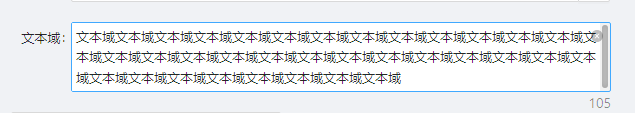
3. InputTextArea文本域
- 页面效果
- 示例代码
const schemas: FormSchema[] = [
    {
      label: '文本域',
      field: 'textArea',
      component:'InputTextArea',
      //属性
      componentProps:{
        //可以点击清除图标删除内容
        allowClear: true,
        //是否展示字数
        showCount: true,
        //自适应内容高度,可设置为 true | false 或对象:{ minRows: 2, maxRows: 6 }
        autoSize:{
          //最小显示行数
          minRows: 2,
          //最大显示行数
          maxRows: 3
        },
      }
    },
]
4. InputNumber数值输入框
- 页面效果
- 示例代码

const schemas: FormSchema[] = [
    {
      label: '数值输入框',
      field: 'number',
      component:'InputNumber',
      componentProps:{
        //带标签的 input,设置后置标签
        addonBefore:'保留两位小数',
        //最大值
        max:100,
        //数值精度
        precision:2,
        //步数
        step: 0.1
      }
    },
]
5. Select下拉框
- 页面效果
- 示例代码

const schemas: FormSchema[] = [
    {
      label: '下拉框',
      field: 'jinputtype',
      component: 'Select',
      componentProps: {
        options: [
          { value: 'like', label: '模糊(like)' },
          { value: 'ne', label: '不等于(ne)' },
          { value: 'ge', label: '大于等于(ge)' },
          { value: 'le', label: '小于等于(le)' },
        ],
        //下拉多选
        mode:'multiple',
        //配置是否可搜索
        showSearch: true
      },
    },
]
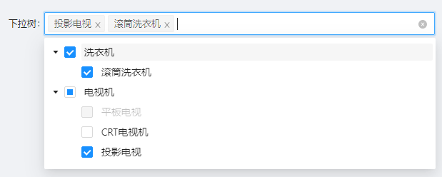
6.TreeSelect树下拉选择
- 页面效果
- 示例代码
const schemas: FormSchema[] = [
    {
      field: 'TreeSelect',
      label: '下拉树',
      component: 'TreeSelect',
      componentProps: {
        //是否显示下拉框,默认false
        treeCheckable: true,
        //标题
        title:'下拉树',
        //下拉树
        treeData:[
          {
            label: '洗衣机',
            value: '0',
            children: [
              {
                label: '滚筒洗衣机',
                value: '0-1',
              },
            ],
          },
          {
            label: '电视机',
            value: '1',
            children: [
              {
                label: '平板电视',
                value: '1-1',
                disabled: true,
              },
              {
                label: 'CRT电视机',
                value: '1-2',
              },
              {
                label: '投影电视',
                value: '1-3',
              },
            ],
          },
        ]
      },
    },
]
7. RadioGroup单选框组
- 页面效果
- 示例代码

const schemas: FormSchema[] = [
    {
      label: '单选框',
      field: 'radioSex',
      component: 'RadioGroup',
      componentProps: {
        //options里面由一个一个的radio组成,支持disabled
        options: [
          { label: '男', value: 1 },
          { label: '女', value: 0 },
        ],
      },
    }
]
8. Chechbox 多选框
- 页面效果
- 示例代码

const schemas: FormSchema[] = [
    {
      label: '多选框',
      field: 'checkSex',
      component: 'Checkbox',
      componentProps: {
        //是否禁用,默认false
        disabled: false,
      },
    },
]
9. CheckboxGroup 多选框组
- 页面效果
- 示例代码

const schemas: FormSchema[] = [
    {
      label: '多选框组',
      field: 'checkSex',
      component: 'CheckboxGroup',
      componentProps: {
        //RadioGroup 下所有 input[type="radio"] 的 name 属性
        name:'爱好',
        //options支持disabled禁用
        options: [
          { label: '运动', value: 0, disabled: true },
          { label: '听音乐', value: 1 },
          { label: '看书', value: 2 },
        ],
      },
      defaultValue:[2]
    }
]
10. Cascader级联选择
- 页面效果
- 示例代码

const schemas: FormSchema[] = [
    {
      label: '级联选择',
      field: 'cascade',
      component: 'Cascader',
      componentProps: {
        //最多显示多少个tag
        maxTagCount:2,
        //浮层预设位置
        placement: 'bottomRight',
        //在选择框中显示搜索框,默认false
        showSearch: true,
        options: [
          {
            label: '北京',
            value: 'BeiJin',
            children: [
              {
                label: '海淀区',
                value: 'HaiDian',
              },
            ],
          },
          {
            label: '江苏省',
            value: 'JiangSu',
            children: [
              {
                label: '南京',
                value: 'Nanjing',
                children: [
                  {
                    label: '中华门',
                    value: 'ZhongHuaMen',
                  },
                ],
              },
            ],
          },
        ],
      },
    },
]
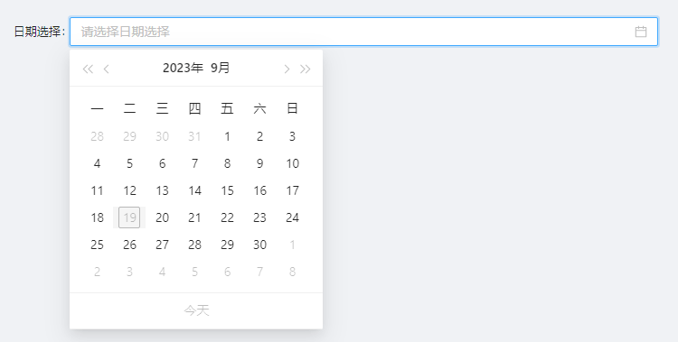
11. DatePicker日期选择框
- 页面效果
- 示例代码
今天不可选择
import dayjs from "dayjs";

const schemas: FormSchema[] = [
    {
      label: '日期选择',
      field: 'dateSelect',
      component: 'DatePicker',
      componentProps: {
        //日期格式化,页面上显示的值
        format:'YYYY-MM-DD',
        //返回值格式化(绑定值的格式)
        valueFormat:'YYYY-MM-DD',
        //是否显示今天按钮
        showToday:true,
        //不可选择日期
        disabledDate:(currentDate)=>{
          let date = dayjs(currentDate).format('YYYY-MM-DD');
          let nowDate =  dayjs(new Date()).format('YYYY-MM-DD');
          //当天不可选择
          if(date == nowDate){
            return true;
          }
          return false;
        }
      },
    },
]
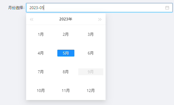
12. MonthPicker月份选择
- 页面效果
- 示例代码
当前月不允许选择
import dayjs from "dayjs";

const schemas: FormSchema[] = [
    {
      label: '月份选择',
      field: 'monthSelect',
      component: 'MonthPicker',
      componentProps: {
        //不可选择日期
        disabledDate:(currentDate)=>{
          let date = dayjs(currentDate).format('YYYY-MM');
          let nowDate =  dayjs(new Date()).format('YYYY-MM');
          //当天不可选择
          if(date == nowDate){
            return true;
          }
          return false;
        }
      },
    },
]
MonthPicker日期格式化默认为YYYY-MM ,同时也支持DatePicker属性
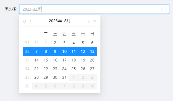
13. WeekPicker周选择
- 页面效果
- 示例代码
只能选择当月的周数,从周一到周日
const schemas: FormSchema[] = [
    {
      label: '周选择',
      field: 'monthSelect',
      component: 'weekSelect',
      componentProps: {
        size:'small',
      },
    },
]
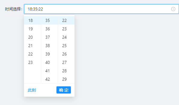
14. TimePicker时间选择
- 页面效果
- 示例代码
const schemas: FormSchema[] = [
    {
      label: '时间选择',
      field: 'timeSelect',
      component: 'TimePicker',
      componentProps: {
        size:'default',
        //日期时间或者时间模式下是否显示此刻,不支持日期时间范围和时间范围
        showNow: true
      },
    },
]
15. RangePicker日期时间范围选择
- 页面效果
- 示例代码
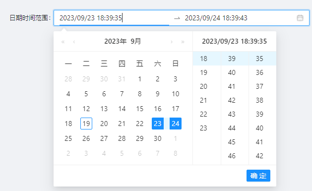
const schemas: FormSchema[] = [
    {
      label: '日期时间范围',
      field: 'dateTimeRangeSelect',
      component: 'RangePicker',
      componentProps: {
        //是否显示时间
        showTime: true,
        //日期格式化
        format:'YYYY/MM/DD HH:mm:ss',
        //范围文本描述用集合
        placeholder:['请选择开始日期时间','请选择结束日期时间']
      },
    },
]
默认值
defaultValue: [new Date("2024-03-21"), new Date("2024-03-27")],
16. RangeDate日期范围选择
- 页面效果
- 示例代码
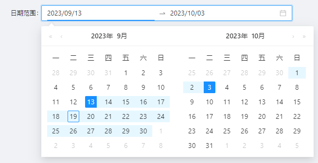
const schemas: FormSchema[] = [
    {
      label: '日期范围',
      field: 'dateRangeSelect',
      component: 'RangeDate',
      componentProps: {
        //日期格式化
        format:'YYYY/MM/DD',
        //范围文本描述用集合
        placeholder:['请选择开始日期','请选择结束日期']
      },
    },
]
17. RangeTime时间范围选择
- 页面效果
- 示例代码
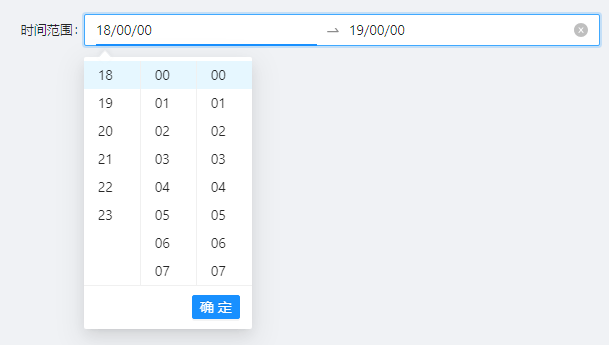
const schemas: FormSchema[] = [
    {
      label: '时间范围',
      field: 'timeRangeSelect',
      component: 'RangeTime',
      componentProps: {
        //日期格式化
        format:'HH/mm/ss',
        //范围文本描述用集合
        placeholder:['请选择开始时间','请选择结束时间'],
      },
    },
]
18. Switch开关
- 页面效果
- 示例代码

const schemas: FormSchema[] = [
    {
      label: '开关',
      field: 'switch',
      component: 'Switch',
      componentProps: {
        //开关大小,可选值:default small
        size:'default',
        //非选中时的内容
        unCheckedChildren:'开启',
        //非选中时的值
        unCheckedValue:'0',
        //选中时的内容
        checkedChildren:'关闭',
        //选中时的值
        checkedValue:'1',
        //是否禁用
        disabled: false
      },
    },
]
19. Slider滑动输入条
- 页面效果
- 示例代码
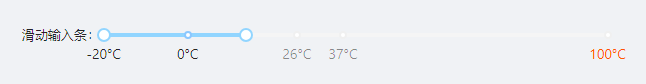
const schemas: FormSchema[] = [
    {
      label: '滑动输入条',
      field: 'slider',
      component: 'Slider',
      componentProps: {
        //最小值
        min:-20,
        //最大值
        max:100,
        //是否为双滑块模式
        range: true,
        //刻度标记
        marks:{
          '-20':'-20°C',
          0: '0°C',
          26: '26°C',
          37: '37°C',
          100: {
            style: {
              color: '#f50',
            },
            label: '100°C',
          },
        }
      },
    },
]
20. Rate评分
- 页面效果
- 示例代码

const schemas: FormSchema[] = [
    {
      label: '评分',
      field: 'rate',
      component: 'Rate',
      componentProps: {
        //是否允许半选
        allowHalf: true,
        //star 总数
        count: 5,
        //tooltip提示,有几颗星写几个
        tooltips:['非常差','较差','正常','很好','非很好']
      },
    },
]
21. Divider分割线
- 页面效果
- 示例代码
const schemas: FormSchema[] = [
    {
      label: '分割线',
      field: 'divisionLine',
      component: 'Divider',
      componentProps: {
        //是否虚线
        dashed: false,
        //分割线标题的位置(left | right | center)
        orientation: 'center',
        //文字是否显示为普通正文样式
        plain:true,
        //水平还是垂直类型(horizontal | vertical)
        type:'horizontal',
      },
    },
]
JEECG封装的控件
1. JDictSelectTag字典
- 页面效果
- 示例代码

const schemas: FormSchema[] = [
  {
    label: '字典标签',
    field: 'dictTags',
    component: 'JDictSelectTag',
    componentProps: {
      //字典code配置,比如通过性别字典编码:sex,也可以使用demo,name,id 表名,名称,值的方式
      dictCode:'sex',
      //支持radio(单选按钮)、radioButton(单选按钮 btn风格)、select(下拉框)
      type:'radioButton'
    },
  },
]
2. JSelectUser用户选择
- 页面效果
- 示例代码
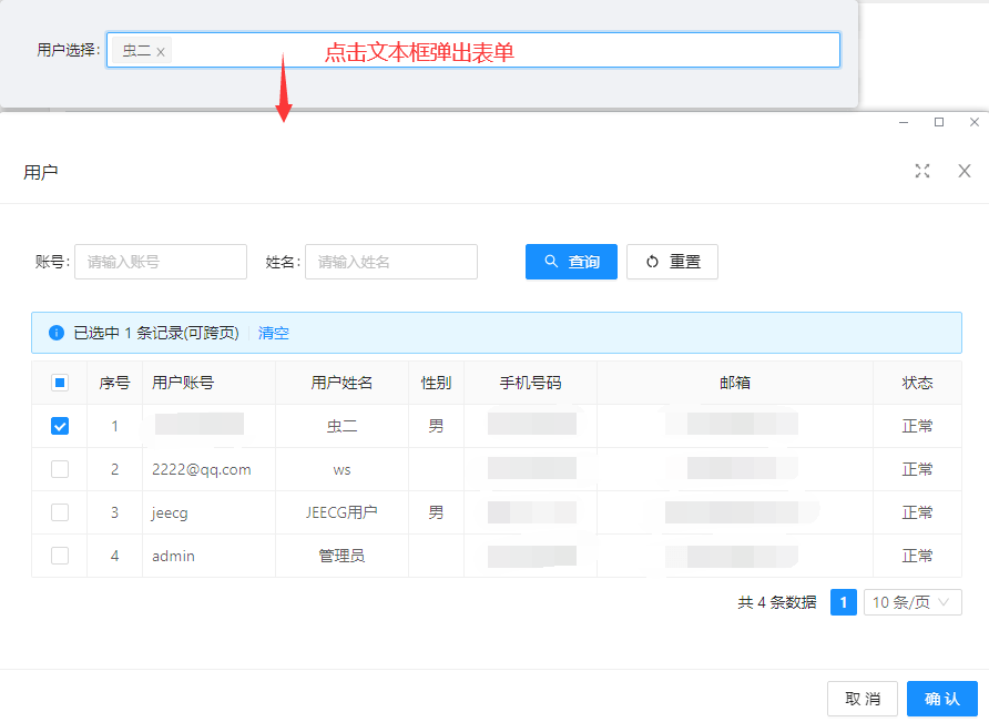
const schemas: FormSchema[] = [
  {
    label: '用户选择',
    field: 'user',
    component: 'JSelectUser',
    componentProps: {
      //取值字段配置,一般为主键字段
      rowKey: 'username',
      //显示字段配置
      labelKey: 'realname',
      //是否显示选择按钮
      showButton: false,
      //用户标题
      modalTitle: '用户',
    },
  },
]
3. UserSelect用户选择
- 页面效果
- 示例代码
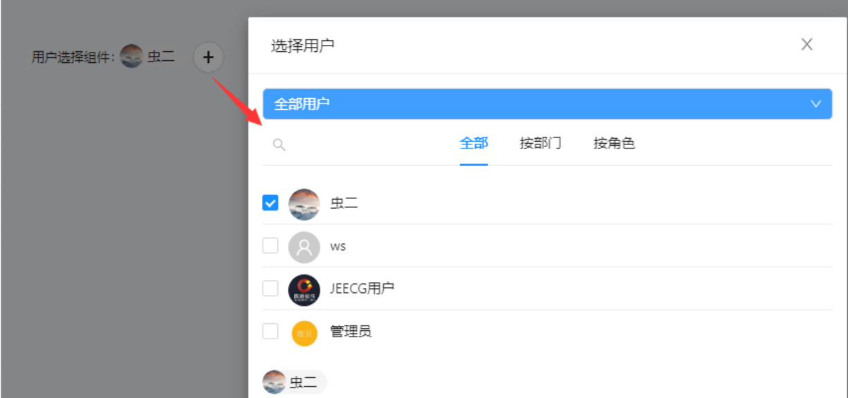
const schemas: FormSchema[] = [
  {
    label: '用户选择组件',
    field: 'userCusSelect',
    component: 'UserSelect',
    componentProps: {
      //是否多选
      multi: true,
      //从用户表中选择一列,其值作为该控件的存储值,默认id列
      store: 'id',
      //是否排除我自己(当前登录用户)
      izExcludeMy: false,
      //是否禁用
      disabled: false,
    },
  },
]
4. JSelectUserByDept根据部门选择用户
- 页面效果
- 示例代码
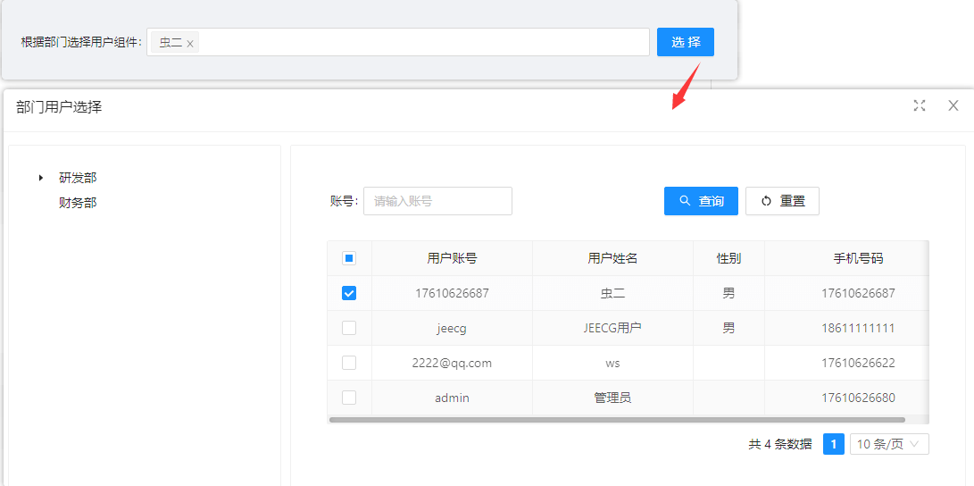
const schemas: FormSchema[] = [
  {
    label: '根据部门选择用户组件',
    field: 'userByDept',
    component: 'JSelectUserByDept',
    componentProps: {
      //是否显示选择按钮
      showButton: true,
      //选择框标题
      modalTitle: '部门用户选择'
    },
  },
]
5. JSelectDept选择部门
- 页面效果
- 示例代码
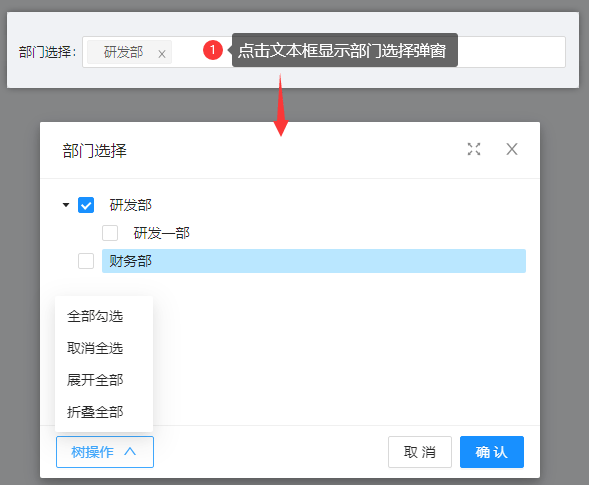
const schemas: FormSchema[] = [
  {
    label: '部门选择',
    field: 'dept',
    component: 'JSelectDept',
    componentProps: {
      //是否开启异步加载
      sync: false,
      //是否显示复选框
      checkable: true,
      //是否显示选择按钮
      showButton: false,
      //父子节点选中状态不再关联
      checkStrictly: true,
      //选择框标题
      modalTitle: '部门选择',
    },
  },
]
6. JSelectRole角色选择
- 页面效果
- 示例代码
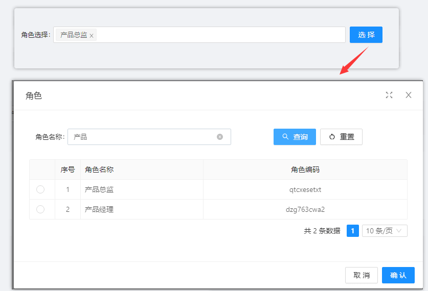
const schemas: FormSchema[] = [
  {
    label: '角色选择',
    field: 'role',
    component: 'JSelectRole',
    componentProps: {
      //请求参数 如params:{"code":"001"}
      params: {},
      //是否单选,默认false
      isRadioSelection: true,
      //角色标题
      modalTitle: '角色',
    },
  },
]
7. RoleSelect角色选择
- 页面效果
- 示例代码
点击文本框弹出角色选择页面
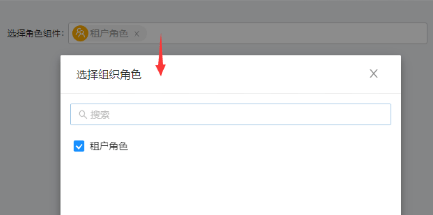
const schemas: FormSchema[] = [
  {
    label: '选择角色组件',
    field: 'roleSelect',
    component: 'RoleSelect',
    componentProps: {
      //最大选择数量
      maxSelectCount: 3,
      //是否单选
      isRadioSelection: false
    },
  },
]
8. JSelectPosition岗位选择
- 页面效果
- 示例代码
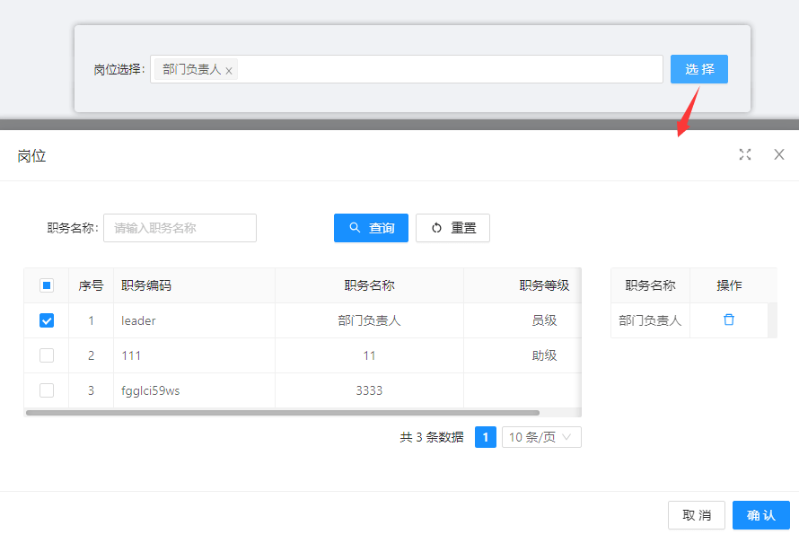
const schemas: FormSchema[] = [
  {
    label: '岗位选择',
    field: 'post',
    component: 'JSelectPosition',
    componentProps: {
      //是否右侧显示选中列表
      showSelected: true,
      //最大选择数量
      maxSelectCount: 1,
      //岗位标题
      modalTitle: '岗位',
    },
  },
]
9. JImageUpload图片上传
- 页面效果
- 示例代码

const schemas: FormSchema[] = [
  {
    label: '图片上传',
    field: 'uploadImage',
    component: 'JImageUpload',
    componentProps: {
      //按钮显示文字
      text:'图片上传',
      //支持两种基本样式picture和picture-card
      listType:'picture-card',
      //用于控制文件上传的业务路径,默认temp
      bizPath:'temp',
      //是否禁用
      disabled:false,
      //最大上传数量
      fileMax:1,
    },
  },
]
10. JUpload上传组件
- 页面效果
- 示例代码
最多上传两个文件

const schemas: FormSchema[] = [
  {
    label: '文件上传',
    field: 'uploadFile',
    component: 'JUpload',
    componentProps: {
      //是否显示选择按钮
      text: '文件上传',
      //最大上传数
      maxCount: 2,
      //是否显示下载按钮
      download: true,
    },
  },
]
11. RadioButtonGroup单选按钮组
- 页面效果
- 示例代码
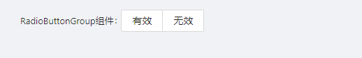
const schemas: FormSchema[] = [
    {
      label: 'RadioButtonGroup组件',
      field: 'status',
      component: 'RadioButtonGroup',
      componentProps: {
        options: [
          { label: '有效', value: 1 },
          { label: '无效', value: 0 },
        ],
      },
    }
]
12. ApiRadioGroup远程Api单选框组
- 页面效果
- 示例代码

const schemas: FormSchema[] = [
  {
    label: '远程Api单选框组',
    field: 'apiRadioGroup',
    component: 'ApiRadioGroup',
    componentProps:{
      //请求接口返回结果{ result:{ list: [ name: '选项0',id: '1' ] }}
      api:()=> defHttp.get({ url: '/mock/select/getDemoOptions' }),
      //请求参数
      params:{},
      //是否为按钮风格类型,默认false
      isBtn: false,
      //返回集合名称
      resultField: 'list',
      //标题字段名称
      labelField: 'name',
      //值字段名称
      valueField: 'id',
    }
  },
]
13. JSelectMultiple下拉多选
- 页面效果
- 示例代码

const schemas: FormSchema[] = [
  {
    label: '下拉多选',
    field: 'selectMultiple',
    component: 'JSelectMultiple',
    componentProps: {
      //字典code配置,比如通过性别字典编码:sex,也可以使用demo,name,id 表名,名称,值的方式
      dictCode:'company_rank',
      //是否只读
      readOnly:false,
    },
  },
]
14. JCheckbox多选
- 页面效果
- 示例代码

const schemas: FormSchema[] = [
    {
      label: '多选',
      field: 'multipleChoice',
      component: 'JCheckbox',
      componentProps:{
        //字典code配置,比如通过职位字典编码:company_rank,也可以使用demo,name,id 表名,名称,值的方式
        dictCode:'company_rank',
        //是否禁用
        disabled: false,
        //没有字典code可以使用option来定义
        // options:[
        //   {label:'CE0',value:'1'}
        // ]
      },
]
15. ApiSelectApi下拉框
- 页面效果
- 示例代码
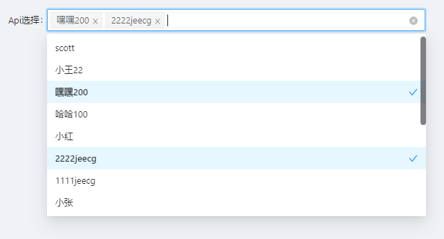
const schemas: FormSchema[] = [
    {
      label: 'Api下拉选择,
      field: 'apiSelect',
      component: 'ApiSelect',
      componentProps: {
        //multiple: 多选;不填写为单选
        mode: 'multiple',
        //请求api,返回结果{ result: { records: [{'id':'1',name:'scott'},{'id':'2',name:'小张'}] }}
        api: ()=> defHttp.get({ url: '' }),
        //数值转成String
        numberToString: false,
        //标题字段
        labelField: 'name',
        //值字段
        valueField: 'id',
        //请求参数
        params:{},
        //返回结果字段
        resultField:'records'
      },
    },
]
16. ApiTreeSelect远程Api树下拉选择
- 页面效果
- 示例代码
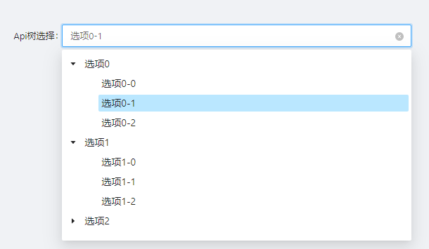
const schemas: FormSchema[] = [
    {
      label: 'Api树选择',
      field: 'apiSelect',
      component: 'ApiTreeSelect',
      componentProps: {
        /* 请求api,返回结果,title:树名称,value:树的value值,children:子节点
         { result: { list: [{ title:'选项0',value:'0',key:'0',
           children: [ {"title": "选项0-0","value": "0-0","key": "0-0"},...]
           }, ...]
         }} */
        api: () => defHttp.get({ url: '/mock/tree/getDemoOptions' }),
        //请求参数
        params: {},
        //返回结果字段
        resultField: 'list',
      },
    },
]
17. JSelectInput可输入下拉框
- 页面效果
- 示例代码
可输入文本,并选择


const schemas: FormSchema[] = [
  {
    label: '可输入下拉框',
    field: 'inputSelect',
    component: 'JSelectInput',
    componentProps: {
      options: [
        { label: 'Default', value: 'default' },
        { label: 'IFrame', value: 'iframe' },
      ],
      //是否为搜索模式
      showSearch: true,
      //是否禁用
      disabled: false
    },
  },
]
18. JSearchSelect字典表的搜索
- 页面效果
- 示例代码
输入框输入文本后进行搜索
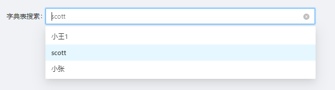
const schemas: FormSchema[] = [
  {
    label: '字典表搜索',
    field: 'dictSearchSelect',
    component: 'JSearchSelect',
    componentProps: {
      //字典code配置,通过 demo,name,id 表名,名称,值的方式
      dict: 'demo,name,id',
      //是否异步加载
      async: true,
      //当async设置为true时有效,表示异步查询时,每次获取数据的数量,默认10
      pageSize:3
    },
  },
]
19. JTreeSelect下拉树选择
- 页面效果
- 示例代码

const schemas: FormSchema[] = [
  {
    label: '下拉树选择',
    field: 'treeCusSelect',
    component: 'JTreeSelect',
    componentProps: {
      //字典code配置,比如通过性别字典编码:sex,也可以使用sys_permission,name,id 表名,名称,值的方式
      dict: 'sys_permission,name,id',
      //父级id字段
      pidField: 'parent_id',
    },
  },
]
20. JCategorySelect分类字典树
- 页面效果
- 示例代码

const schemas: FormSchema[] = [
  {
    label: '分类字典树',
    field: 'dictTree',
    component: 'JCategorySelect',
    componentProps: {
      //占位内容
      placeholder:'请选择分类字典树',
      //查询条件,如“{'name':'笔记本'}”
      condition:"",
      //是否多选
      multiple: false,
      //起始选择code,见配置的分类字典的类型编码
      pcode: 'A04',
      //父级id
      pid:'',
      //返回key
      back:'id',
    },
  },
]
21. JTreeDict分类字典树形组件
- 页面效果
- 示例代码

const schemas: FormSchema[] = [
  {
    label: '分类字典树',
    field: 'treeDict',
    component: 'JTreeDict',
    componentProps:{
      //指定当前组件需要存储的字段 可选: id(主键)和code(编码)
      field:'id',
      //是否为异步
      async: true,
      //是否禁用
      disabled: false,
      //指定一个节点的编码,加载该节点下的所有字典数据,若不指定,默认加载所有数据
      parentCode:'A04'
    },
  },
]
22. JPopup弹窗选择
- 页面效果
- 示例代码
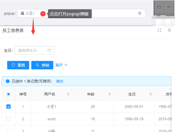
const schemas: FormSchema[] = [
  {
    label: 'popup',
    field: 'popup',
    component: 'JPopup',
    componentProps: ({ formActionType }) => {
      const {setFieldsValue} = formActionType;
      return{
        setFieldsValue:setFieldsValue,
        //online报表编码
        code:"demo",
        //是否为多选
        multi:false,
        //字段配置
        fieldConfig: [
          { source: 'name', target: 'popup' },
        ],
      }
    },
  },
]
23. JSwitch开关
- 页面效果
- 示例代码

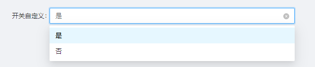
const schemas: FormSchema[] = [
  {
    label: '开关自定义',
    field: 'switch',
    component: 'JSwitch',
    componentProps:{
      //取值 options
      options:['Y','N'],
      //文本option
      labelOptions:['是', '否'],
      //是否启用下拉
      query: true,
      //是否禁用
      disabled: false,
    },
  },
]
24. InputSearch文本搜索框
- 页面效果
- 示例代码

export const schemas: FormSchema[] = [
    {
      label: '搜索框',
      field: 'searchBox',
      component:'InputSearch',
      componentProps:{
        //搜索之后触发事件
        onSearch:(value:any)=>{
          //搜索之后的逻辑处理
          console.log(value)
        }
      }
    },
]
除了搜索之后触发事件,其余与Input属性一致
25. JEditor富文本
- 页面效果
- 示例代码

const schemas: FormSchema[] = [
  {
    label: '富文本',
    field: 'editor',
    component: 'JEditor',
    componentProps: {
      //是否禁用
      disabled: false
    },
  },
]
26. JMarkdownEditor编辑器
- 页面效果
- 示例代码
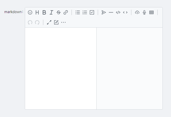
const schemas: FormSchema[] = [
  {
    label: 'markdown',
    field: 'markdown',
    component: 'JMarkdownEditor',
    componentProps: {
      //是否禁用
      disabled: false
    },
  },
]
27. JAreaLinkage省市县联动
- 页面效果
- 示例代码
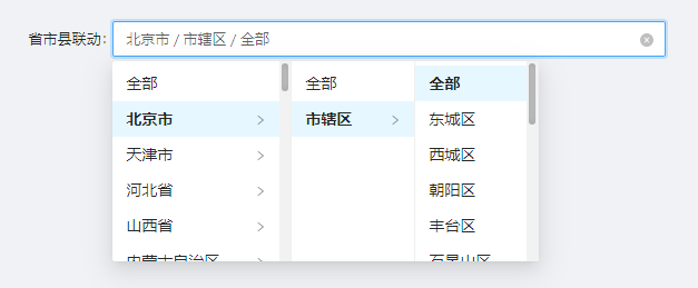
const schemas: FormSchema[] = [
  {
    label: '省市县联动',
    field: 'pwd',
    component: 'JAreaLinkage',
    componentProps: {
      //是否显示区县,默认true,否则只显示省
      showArea: true,
      //是否显示全部文本,默认false
      showAll: true,
    },
  },
]
28. JAreaSelect省市县联动
- 页面效果
- 示例代码

const schemas: FormSchema[] = [
  {
    label: '省市县级联动',
    field: 'provinceArea',
    component: 'JAreaSelect',
    componentProps: {
      //级别 1 只显示省 2 省市 3 省市区
      level:3
    },
  },
]
29. JInputPop多行输入窗口
- 页面效果
- 示例代码

const schemas: FormSchema[] = [
  {
    label: '分类字典树',
    field: 'treeDict',
    component: 'JTreeDict',
    componentProps:{
      //指定当前组件需要存储的字段 可选: id(主键)和code(编码)
      field:'id',
      //是否为异步
      async: true,
      //是否禁用
      disabled: false,
      //指定一个节点的编码,加载该节点下的所有字典数据,若不指定,默认加载所有数据
      parentCode:'A04'
    },
  },
]
30. StrengthMeter校验密码强度
- 页面效果
- 示例代码
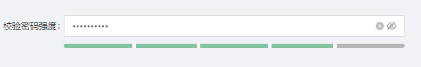
const schemas: FormSchema[] = [
    {
      label: '校验密码强度',
      field: 'pwd',
      component: 'StrengthMeter',
      componentProps: {
        //是否显示密码文本框
        showInput: true,
        //是否禁用
        disabled: false,
      },
    },
]
31. JCodeEditor代码编辑器
- 页面效果
- 示例代码

const schemas: FormSchema[] = [
  {
    label: '代码编辑器组件',
    field: 'jCode',
    component: 'JCodeEditor',
    componentProps: {
      //高度,默认auto
      height:'150px',
      //是否禁用
      disabled:false,
      //是否全屏
      fullScreen:false,
      //全屏之后的坐标
      zIndex: 999,
      //代码主题,目前只支持idea,可在组件自行扩展
      theme:'idea',
      //代码提示
      keywords:['console'],
      //语言如(javascript,vue,markdown)可在组件自行扩展
      language:'javascript'
    },
  },
]
32. JEasyCron定时表达式选择
- 页面效果
- 示例代码
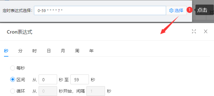
const schemas: FormSchema[] = [
  {
    label: '定时表达式选择',
    field: 'timing',
    component: 'JEasyCron',
    componentProps:{
      //是否隐藏参数秒和年设置,如果隐藏,那么参数秒和年将会全部忽略掉。
      hideSecond: false,
      //是否隐藏参数年设置,如果隐藏,那么参数年将会全部忽略掉
      hideYear: false,
      //是否禁用
      disabled: false,
      //获取预览执行时间列表的函数,格式为:remote (cron值, time时间戳, cb回调函数)
      remote:(cron,time,cb)=>{}
    },
  },
]
33. JAddInput动态创建input框
- 页面效果
- 示例代码

const schemas: FormSchema[] = [
  {
    label: '动态创建input框',
    field: 'jAddInput',
    component: 'JAddInput',
    componentProps: {
      //自定义超过多少行才会显示删除按钮,默认为1
      min:1
    },
  },
]
34. JRangeNumber数值范围输入框
- 页面效果
- 示例代码

const schemas: FormSchema[] = [
  {
    label: '数值范围输入框',
    field: 'rangeNumber',
    component: 'JRangeNumber',
  },
]
35. InputCountDown验证码组件
- 页面效果
- 示例代码
未发送短信验证码时的效果

发送短信验证码的效果

export const schemas: FormSchema[] = [
  {
    label: '验证码',
    field: 'code',
    component: 'InputCountDown',
    componentProps: {
      //'default': 默认, 'large': 最大, 'small': 最小
      size:'default',
      //倒计时
      count: 120,
    },
  },
注意事项
1、不生效的属性
componentProps中对应的value属性和defaultValue属性不生效
defaultValue需要与componentProps同一级填写
const schemas: FormSchema[] = [
  {
    label: '姓名',
    field: 'name',
    component:'Input',
    componentProps:{
      prefix:'中文',
      showCount: true
    },
    defaultValue:'张三'
  },
]